A real product with real users: a mobile web app I designed, built, and shipped with AI to keep my family connected across cities. Still in use today, and still shipping changes from real feedback.
The result
The Family Fridge is exactly what it sounds like: a digital version of a fridge door covered in photos, drawings, and notes, except this one lives on everyone’s phone.
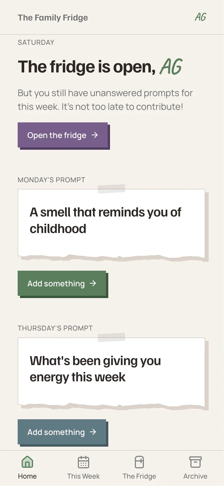
Each week, two prompts drop (e.g. “a sound from your day,” “something you did just for you”). Everyone answers in whatever format fits the moment: a photo, a few words, an emoji, a voice recording, a song link. Nobody sees anyone else’s answers until Saturday, when the fridge reveals the whole week at once.
I released the MVP to my family on May 10th, gathered feedback from them, and have shipped 17+ fixes and features since then (with more on the way).
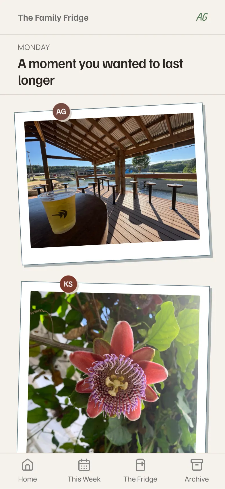
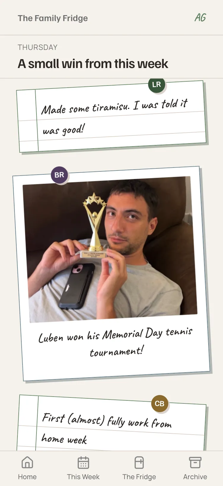
Family group texts are great for planning get-togethers, but not for the day-to-day thoughts and experiences that feel too mundane to share in the moment. The nice thing about The Family Fridge is the lowkey way it draws those out and builds a fuller picture of what everyone’s been experiencing through the week.
— Steve Bayliss, my father-in-law
This case study tells the story of:
- A working ship → iterate → ship loop. My family’s feedback became product changes they felt the very next week. Key sections:
- The payoff of good systems thinking in an AI workflow. When an AI can build at the speed of light, a designer with sharp instincts and a good systems brain keeps it on the rails. Key sections:
- Product judgment about what not to build. The hardest calls weren’t how to build a feature, but whether it belonged at all. Key section:
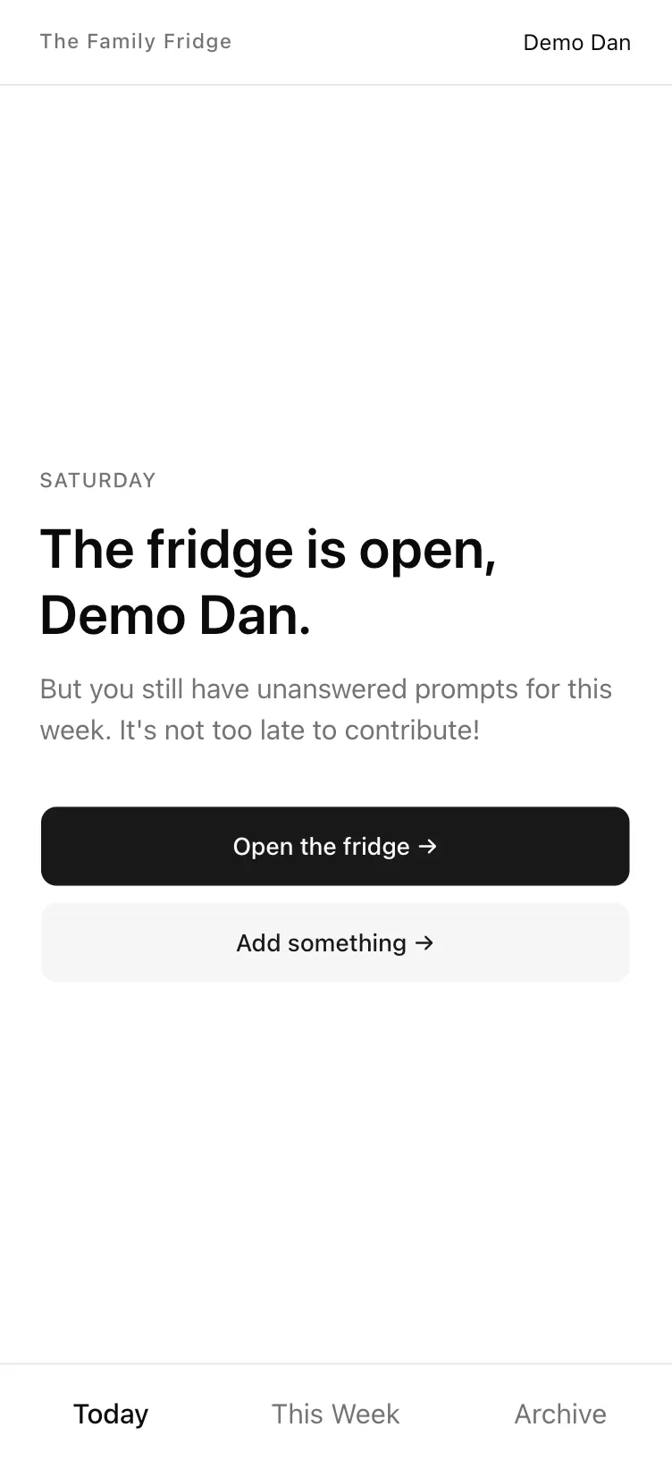
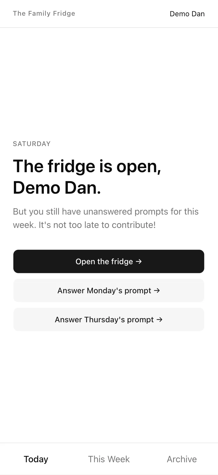
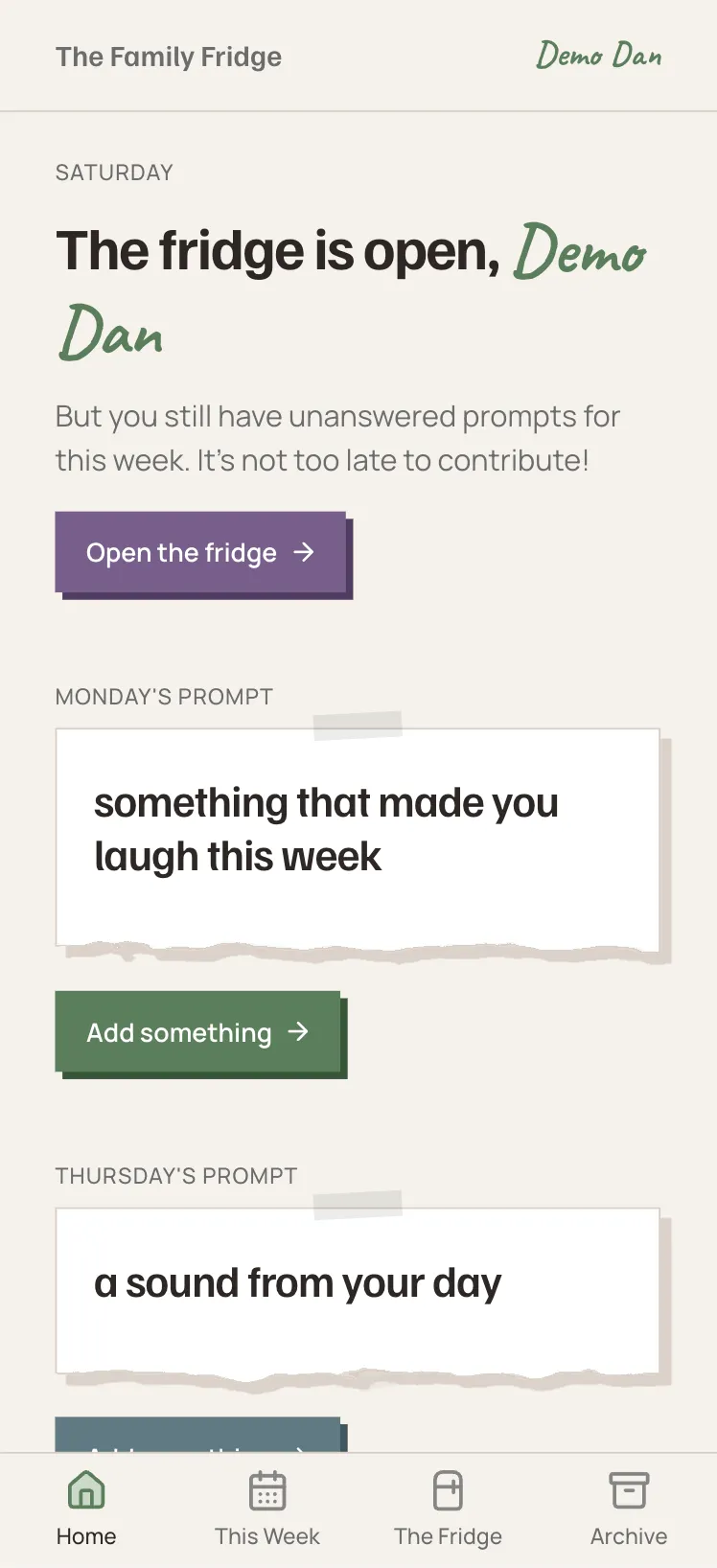
See it in three real stages
I “froze” the app at a few different points during the build so viewers could click through the real versions and see its growth.
All demos are frozen on Saturday with both prompts unanswered. Feel free to submit real content, but the demos are stateless, so posts won’t save to the fridge.
The backstory
After rediscovering my love for design with AI (opens in new tab), I caught the building bug and decided to make a real product with real users.
My husband and I live in a different city than both of our families, and keeping up with everyone is a task split between asynchronous group chats. With some brainstorming help from Claude, I decided to build The Family Fridge as a low-stakes way for us to stay in touch and see what our loved ones are up to in day to day life.
Design principles
Slow responders are first-class citizens.
My family has a running joke that my dad takes 3–5 business days to respond to a single text. Most social products punish that kind of behavior (losing streaks, decaying visibility, and the like). The Family Fridge does the opposite. Its job is to make showing up feel good, not to manufacture engagement.
Designed for this family, not for all families.
This is a homemade artifact for a specific set of people, not a generic product looking to scale. With non-technical relatives in the audience, usability had to be clean and obvious: no reinventing the wheel on basic layouts and interactions.
Token discipline from day one.
My priority was to get a functioning product shipped and in my family’s hands, so I made a deliberate call to defer the visual styling until after the initial release. I knew this would only work if the underlying system was tokenized and consistent, so I created guardrails to ensure Claude didn’t drift and hard code values all over the place without me noticing. (Spoiler: the bet paid off.)
MVP
The build
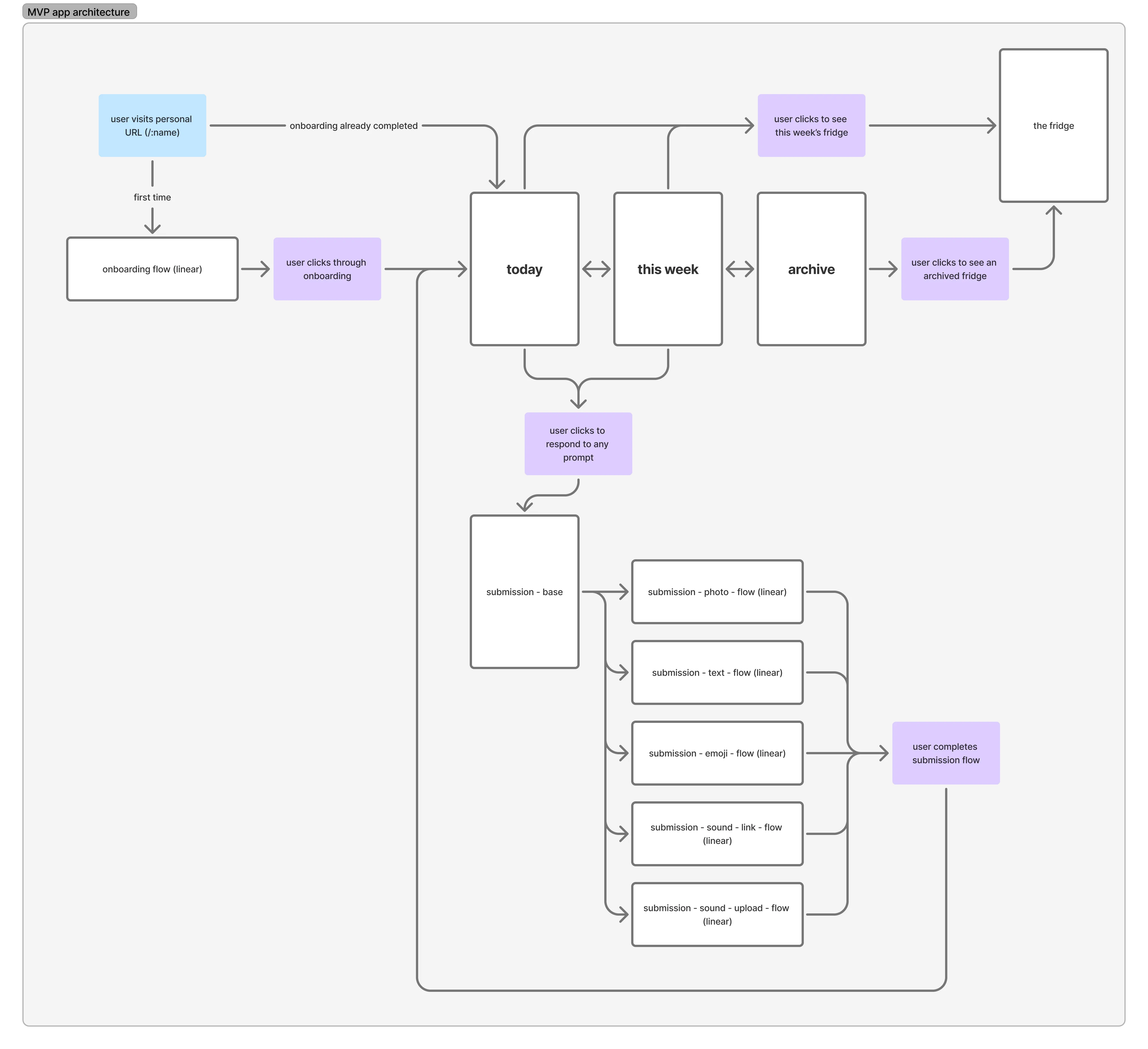
Before writing any app code, I spent about two weeks planning the whole thing with Claude: a brief, 3 architecture diagrams, 45 wireframes in Paper, a component inventory, and a build plan with the stack chosen and justified. The planning even included an audit where Claude read every doc, diagram, and wireframe and flagged the contradictions. That pass caught 23 inconsistencies before a single line of code was written, and it became the seed of a custom sweep skill I leaned on for the rest of the project (more on that in Under the hood).
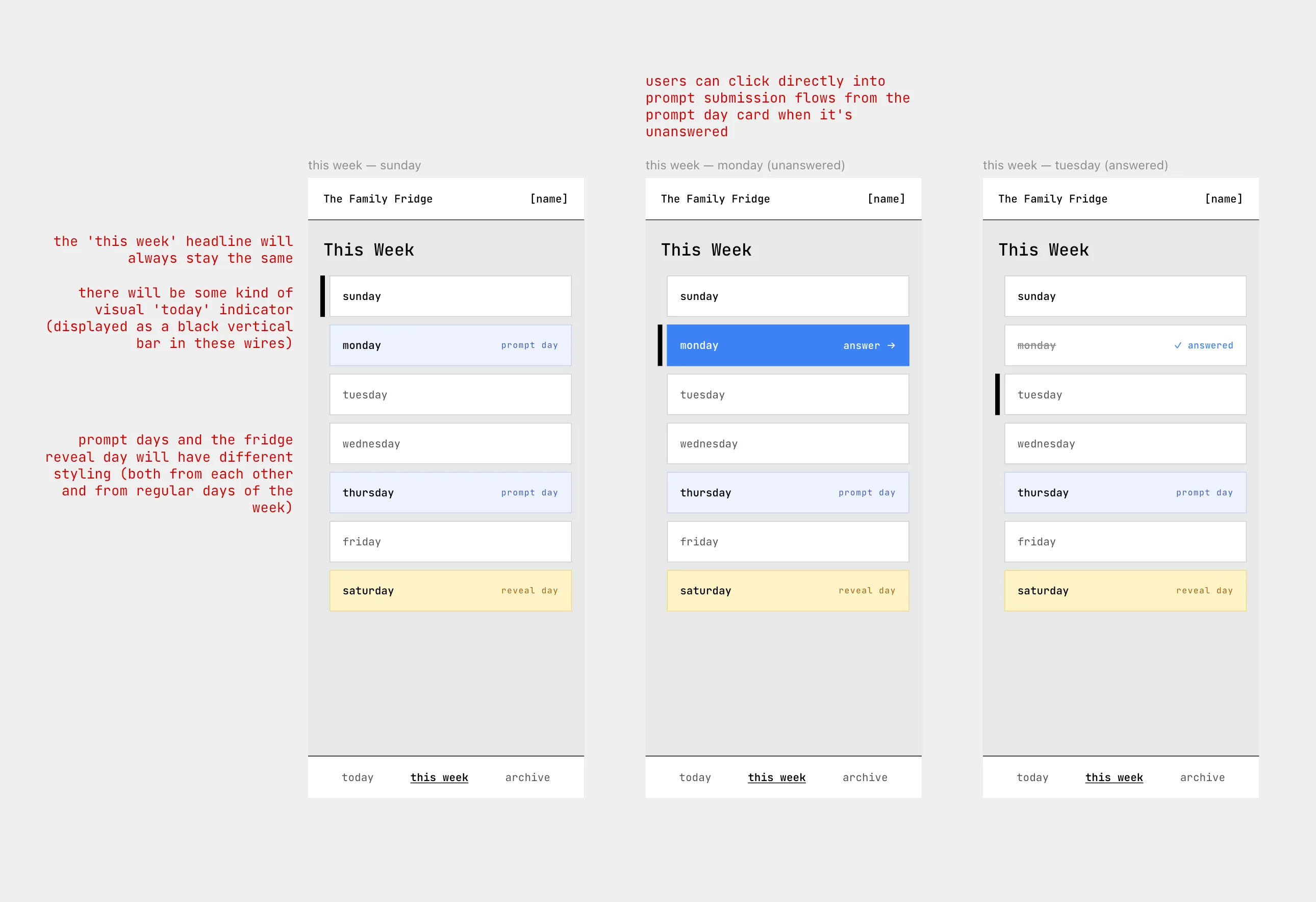
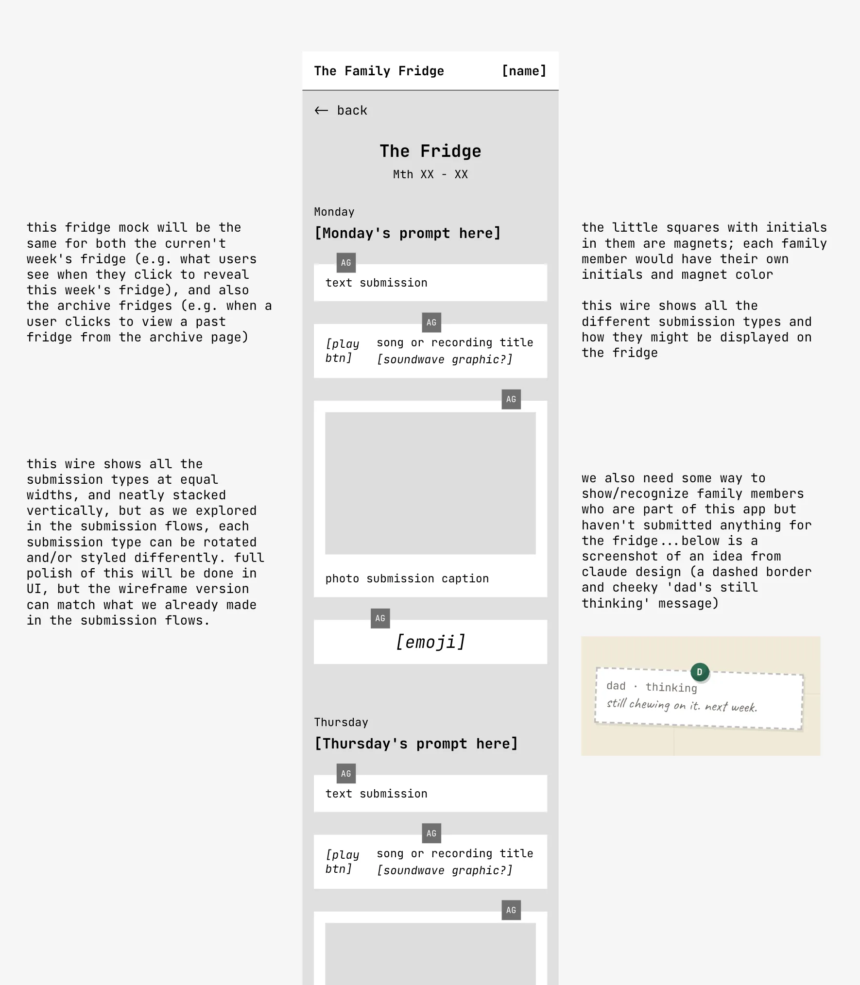
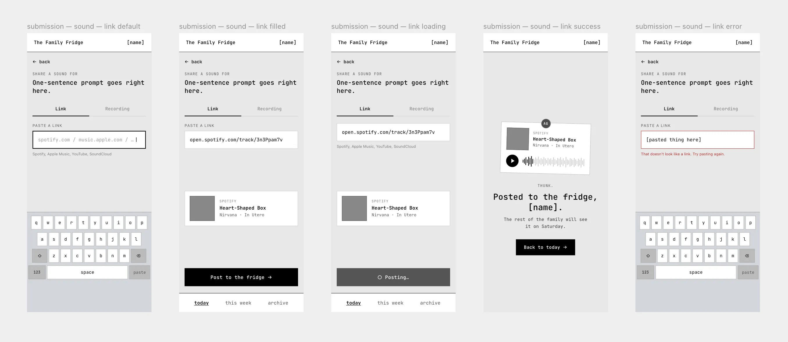
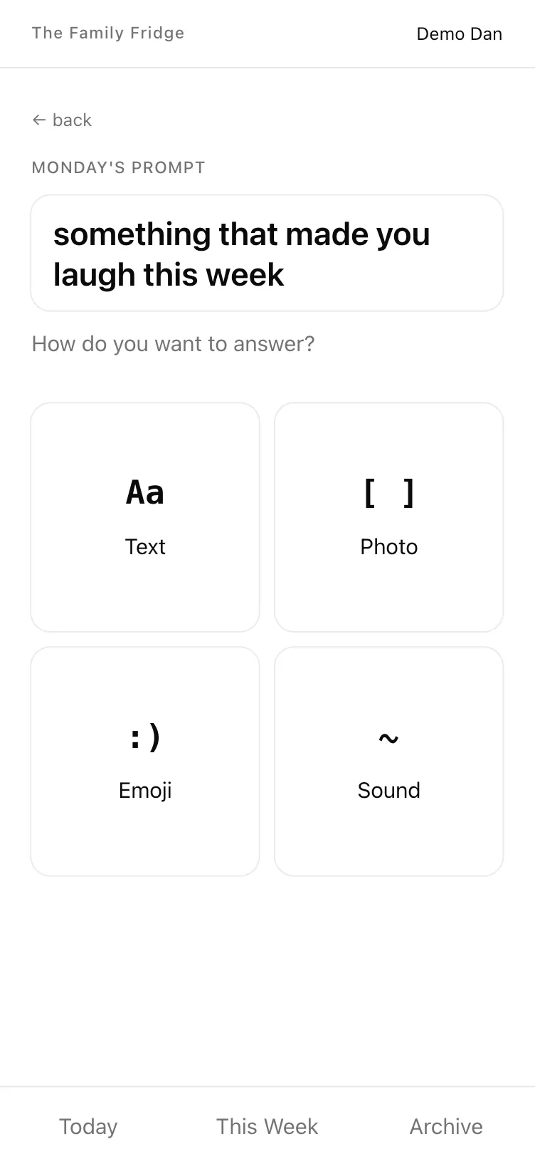
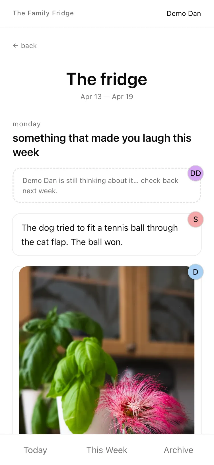
On May 10th, I shipped the MVP and put it in my family’s hands. It was unstyled and a little rough around the edges UX-wise, but it worked.
Post-launch bugs
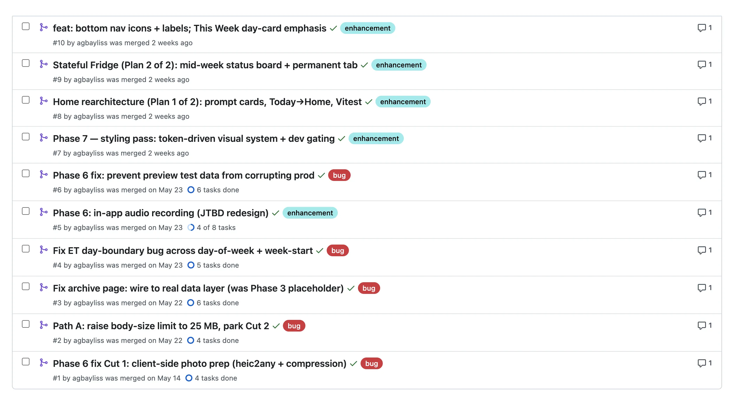
The first week, my father-in-law texted me that his photo wouldn’t upload: he kept hitting a catch-all network error, and “Try again” did nothing. I dug in with Claude and found the real cause: a conversion and compression step that was specced in the original scope document never actually got built, so his full-size photo (a few MB) was getting rejected on upload. We fixed it the same day, and nobody has had upload trouble since.
Then I went back to ask the more interesting question: how did a specced feature not get built? I’d been running my custom sweep skill after each session to catch loose ends, so why didn’t it catch this? We found the hole: sweep never explicitly confirmed that every specced piece had actually shipped that session. So I added that check to the skill. This is the whole game with AI, in miniature: part of the design work is designing the guardrails that keep the robots on track, and identifying and patching holes in them as you go along.
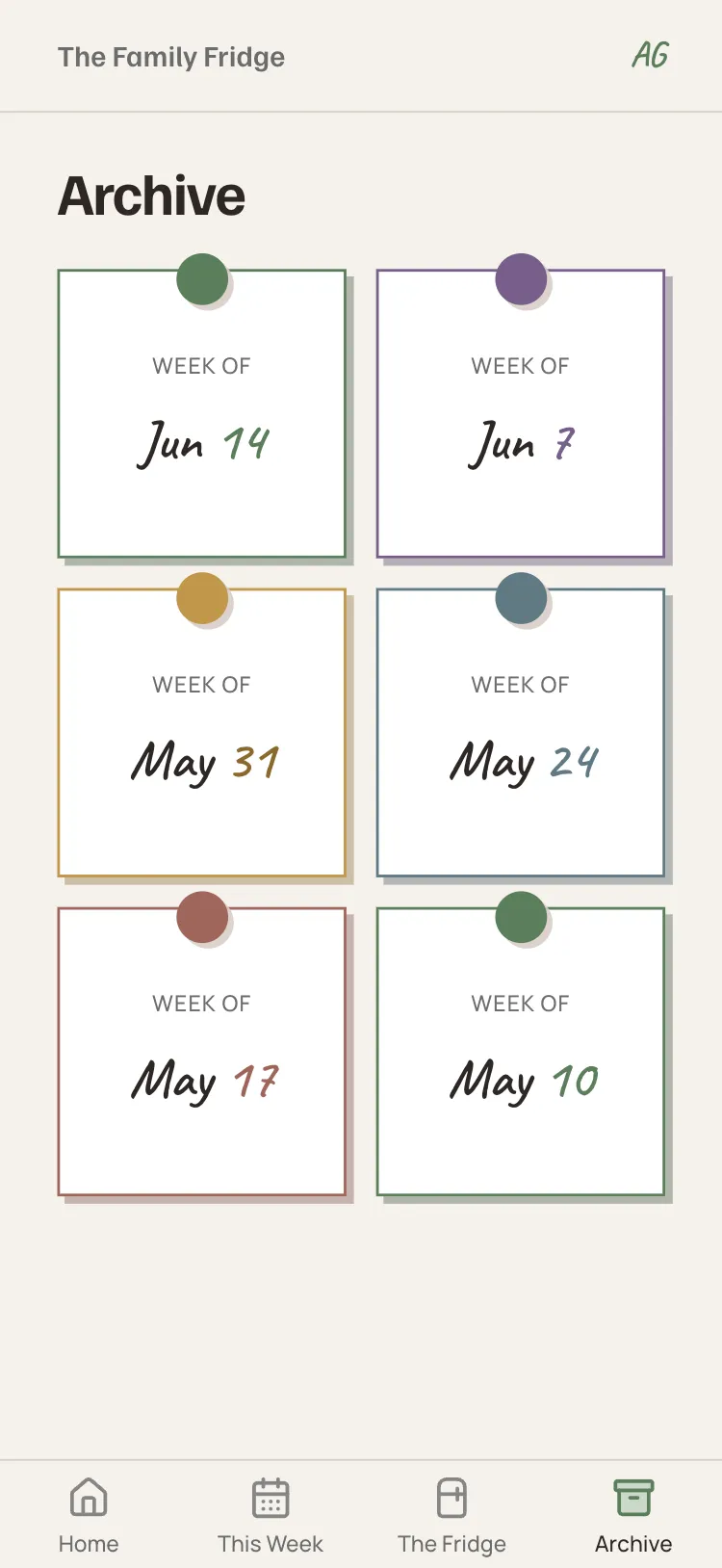
Other fixes post-launch: boosting the accepted audio file size limit, fixing the archive page when it wasn’t showing the first week’s fridge after it closed, and fixing the app’s internal clock, which was running about 5 hours ahead of the correct time zone.
Solving friction on audio uploads
The problem
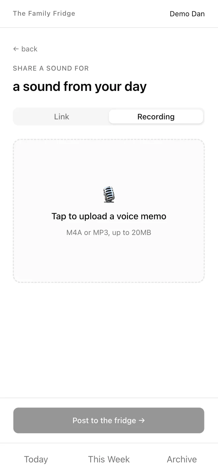
The other prompt from week one was “A sound an animal makes that you’d know anywhere.” My mom texted me: “I made a short recording on my phone, but when I tap to upload I can’t locate it.”
What followed was an embarrassingly long back-and-forth of texts, annotated screenshots, and instructions. At one point she said “I’m lost.” (Just the thing to boost a designer’s ego.)
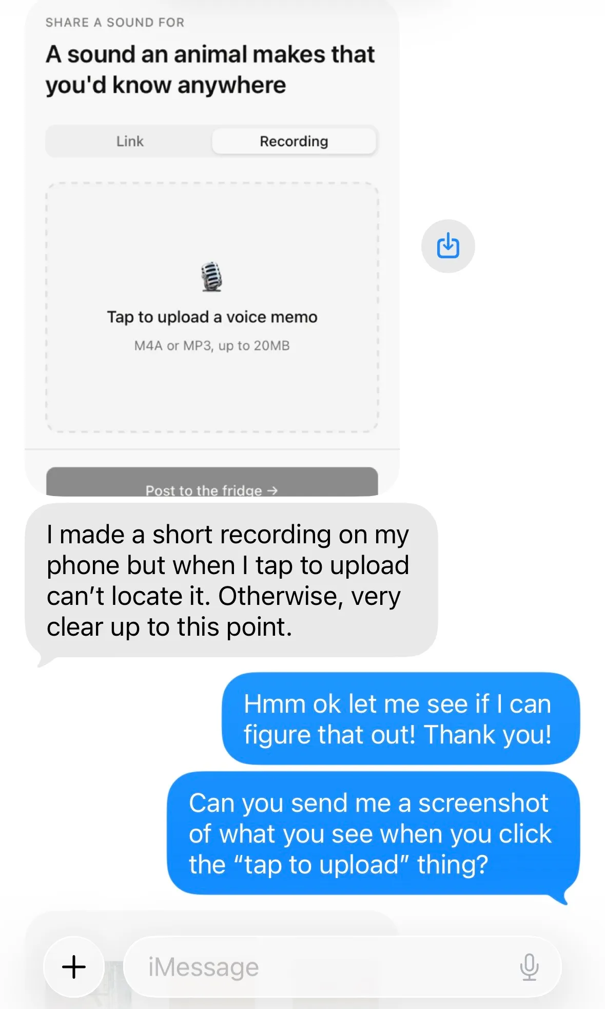
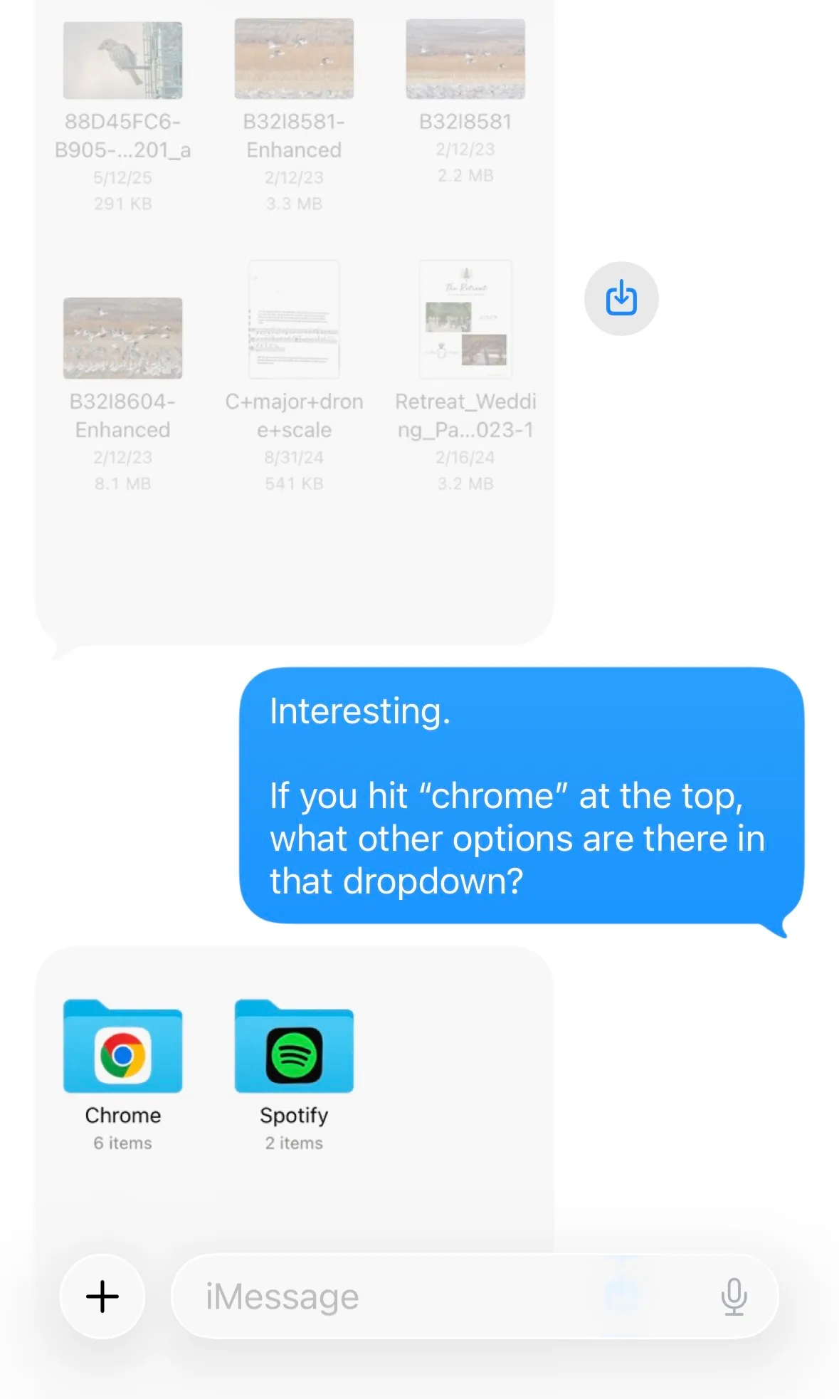
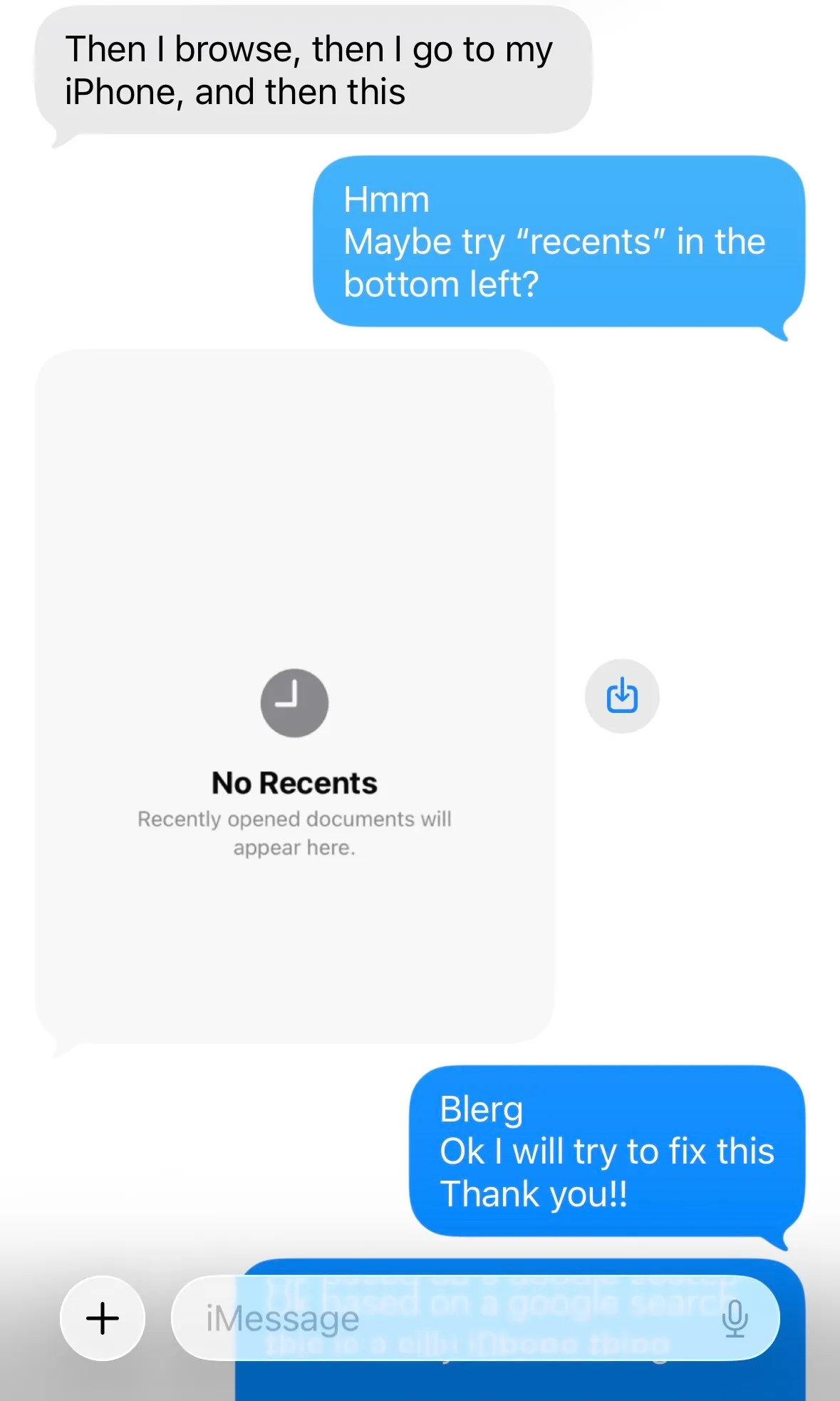
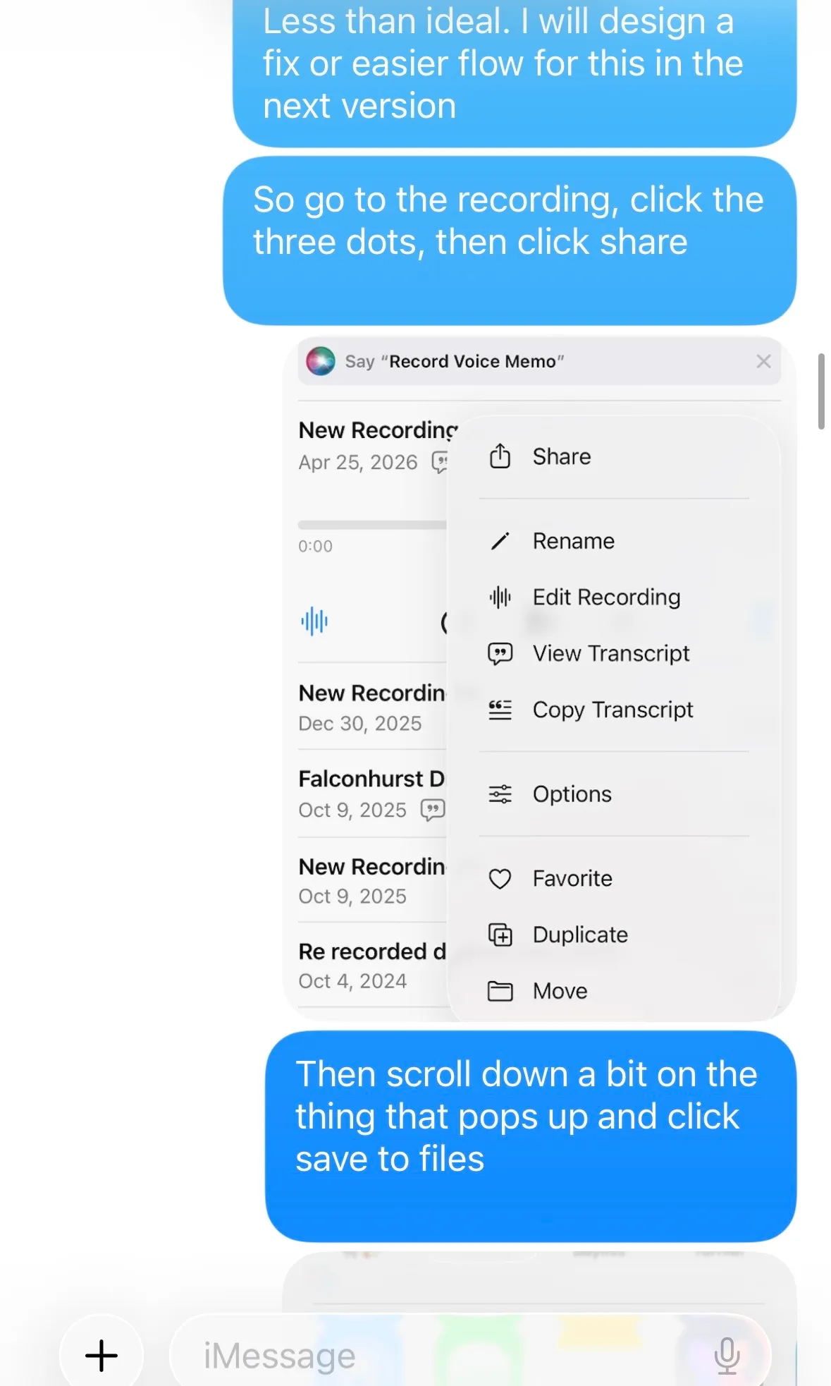
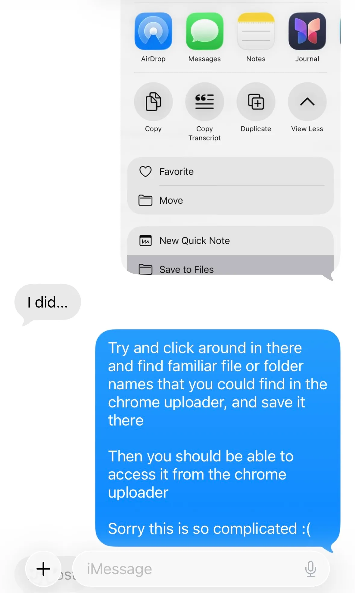
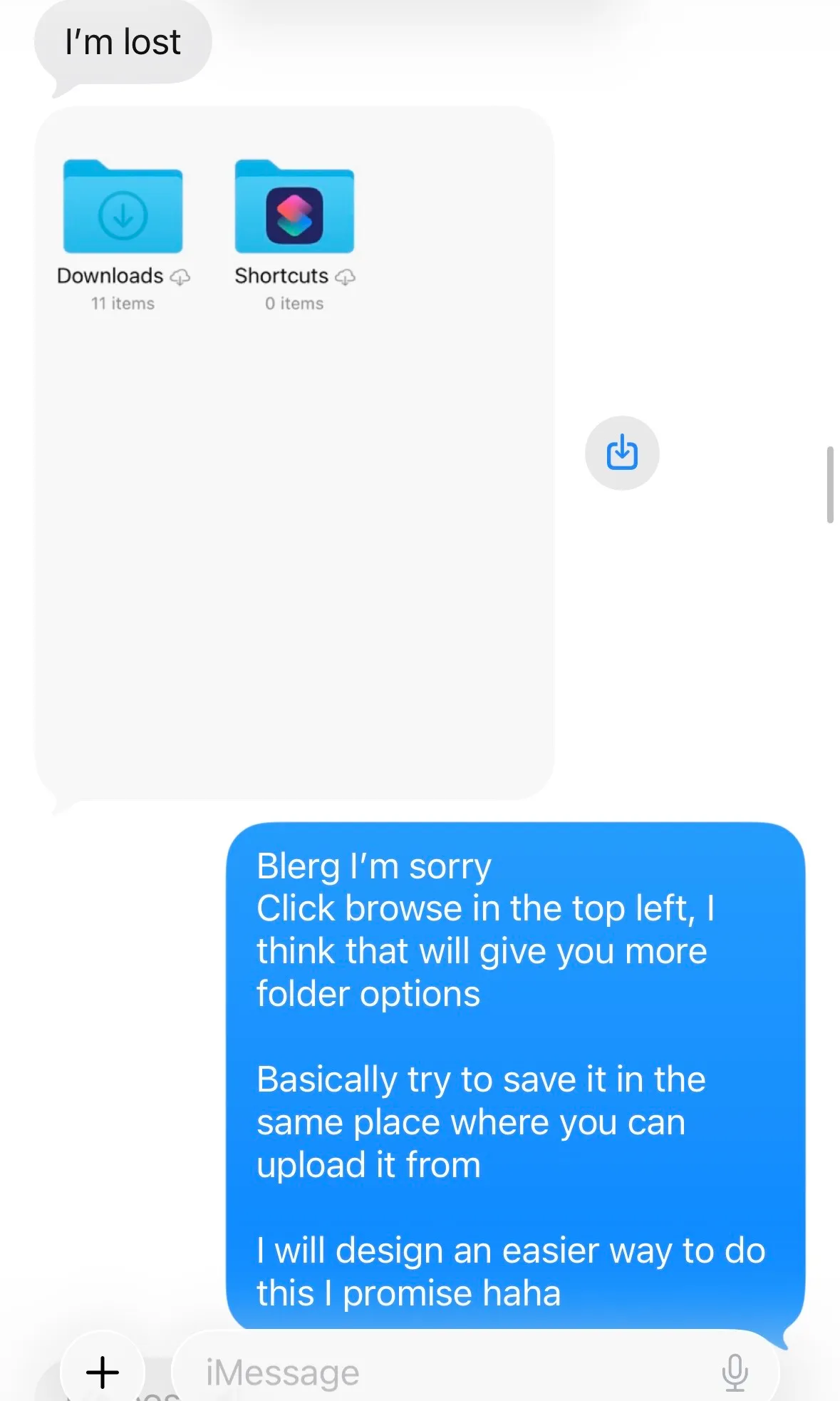
We eventually got her voice memo uploaded. The flow that tripped her up wasn’t even inside The Family Fridge: it was silliness with how iOS handles voice memo files. To upload her file, she had to:
- Go into Voice Memos
- Manually save her recording somewhere in her iPhone’s Files (who even uses Files, anyway?)
- Go back to The Family Fridge in the browser
- Navigate through the prompt submission flow to Sound
- Tap “Upload”
- Find her recording in the same file path where she just saved it
Like I said. Silly.
The gap came from testing audio uploads only on localhost, where I was uploading files from my desktop just to confirm it worked at all. I’d validated that the feature worked, but never walked the real flow on the device my family would actually use. A good reminder that “it works” and “it works the way a real person will reach it” are different tests.
Considered solutions
A brainstorming session with Claude resulted in four possible solutions to fix the clunky audio upload flow:
- Paste from clipboard. Voice Memos have a “Copy” option on iPhones…did that mean they could also be pasted into the browser? This still required a loop out of The Family Fridge to a different program and back, but at least avoided the Files nightmare.
- In-app recording. This would collapse the audio capture and submission into one step, all housed in The Family Fridge, with no looping between apps.
- iOS share target. The Family Fridge would be an option on the menu that appears when users click “Share” on their iPhone. A partial solve, but scoped to iPhone users only, and it would exclude a few of my family members who are on Androids.
- Email submission. Still required multiple apps in play, and felt a little archaic, but this was at least a medium my mom was very familiar with.
JTBD reframe
Before sending Claude off to research the feasibility of that list, I stepped back and looked at the problem through a Jobs-to-be-Done lens. What job was my mom actually hiring The Family Fridge to do? It wasn’t “upload a voice memo”; that’s feature-specific and far too narrow. I know my mom well, so I put myself in her shoes. The job I landed on:
When a prompt arrives and I want to respond out loud, I want to capture what I want to say and get it to my family quickly, so I can participate without losing the impulse.
— my mom, probably
This pointed straight at in-app recording.
The word “capture” (instead of “upload”) broadened the scope past iPhone Voice Memos and put the priority on recording the sound she wanted, not handling a specific file format. The phrase “without losing the impulse” told me that cutting step count was the highest priority. (Nothing kills the moment like spending ten minutes lost in iPhone Files and texting your daughter for help.)
The solve
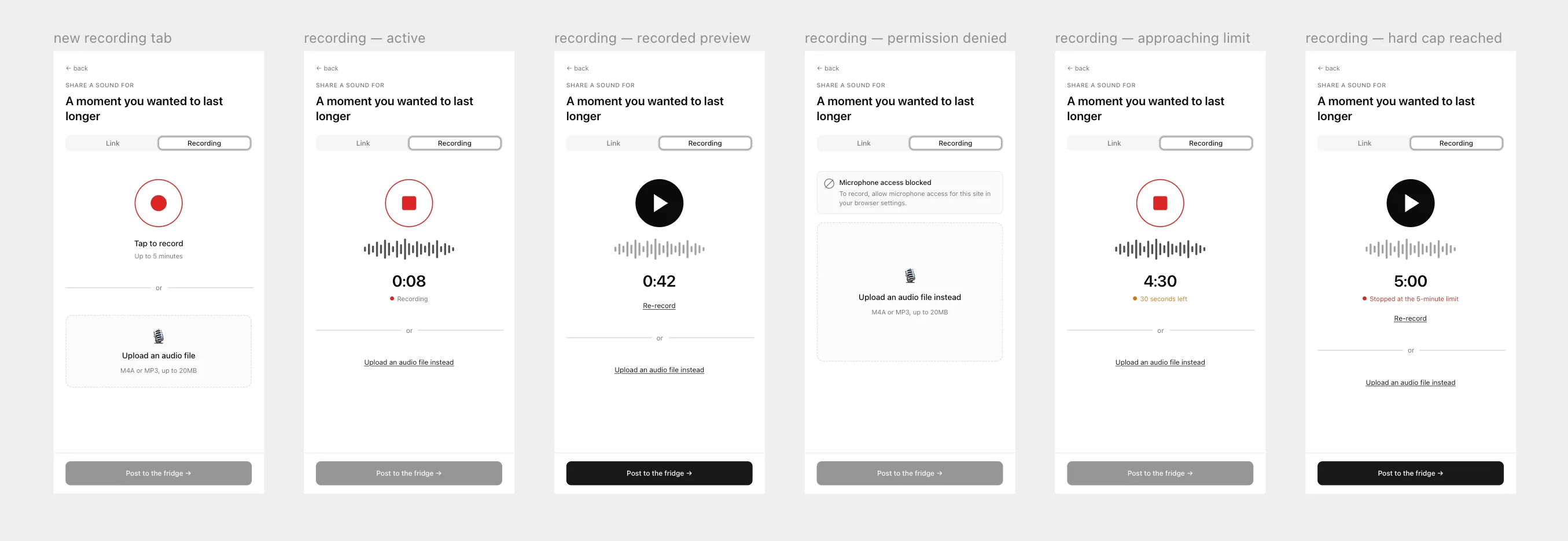
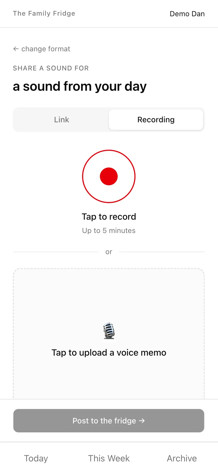
I designed the new in-app recording feature in Paper, then shipped it two weeks after my mom’s run-in with iPhone Files. The week of May 31st, she successfully used it to record a response to the prompt “A sound from your day.”
Token discipline paid off in styling
Remember my bet from the start: build unstyled, keep token discipline tight along the way, and style the app after MVP shipped.
The guard rails
From the first commit of the build I kept everything tokenized and consistent: spacing, color, and type all referenced a shared token set, and layout ran through a small group of reusable primitives (an AppFrame, an AppShell, a Stack, and a Grid) instead of one-off CSS scattered across pages.
To hold myself (and Claude) to that discipline as I built, I wrote a custom systems-brain skill that routes any styling change through the tokens that already exist instead of letting a hardcoded one-off slip in.
The result
When it was time for styling, I did the whole visual pass in one concentrated stretch. Claude Design got me over the blank canvas hump and gave me one color concept I liked (“dried flowers”), and then I had to take it far past where AI left it, iterating on the Paper canvas and in code with playgrounds and preview pages.
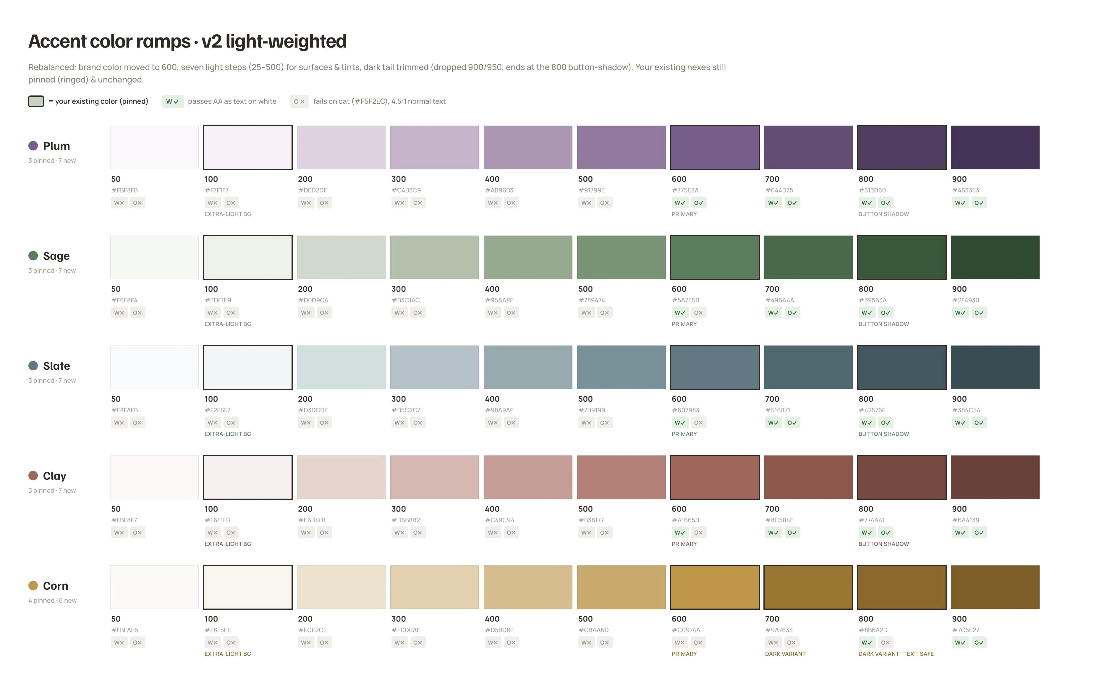
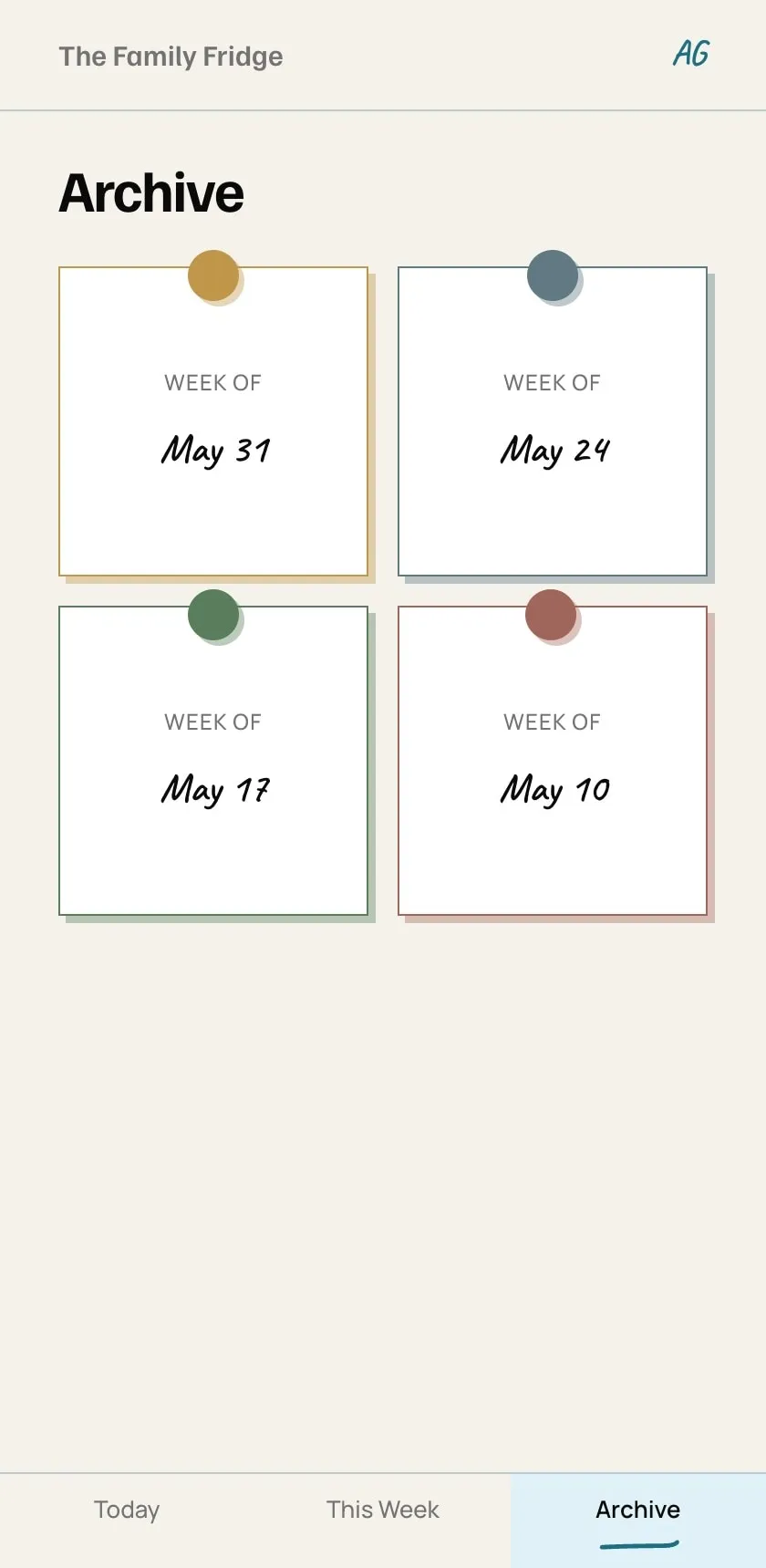
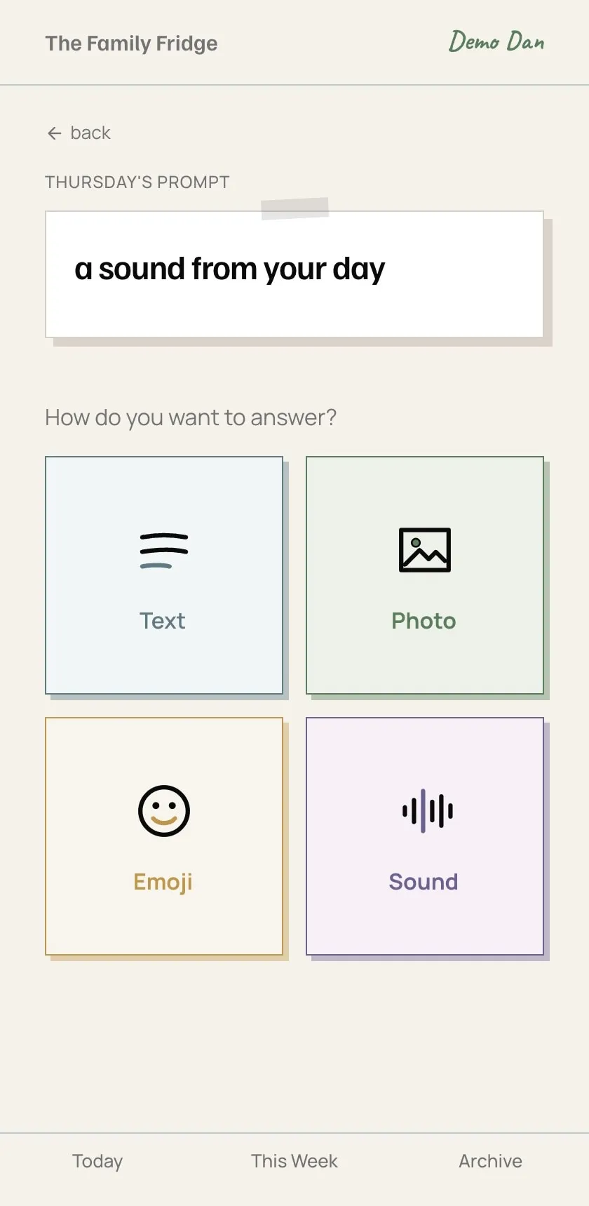
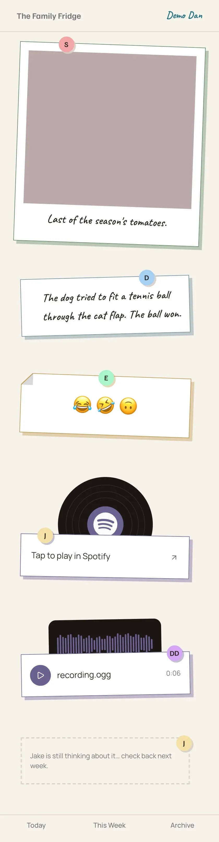
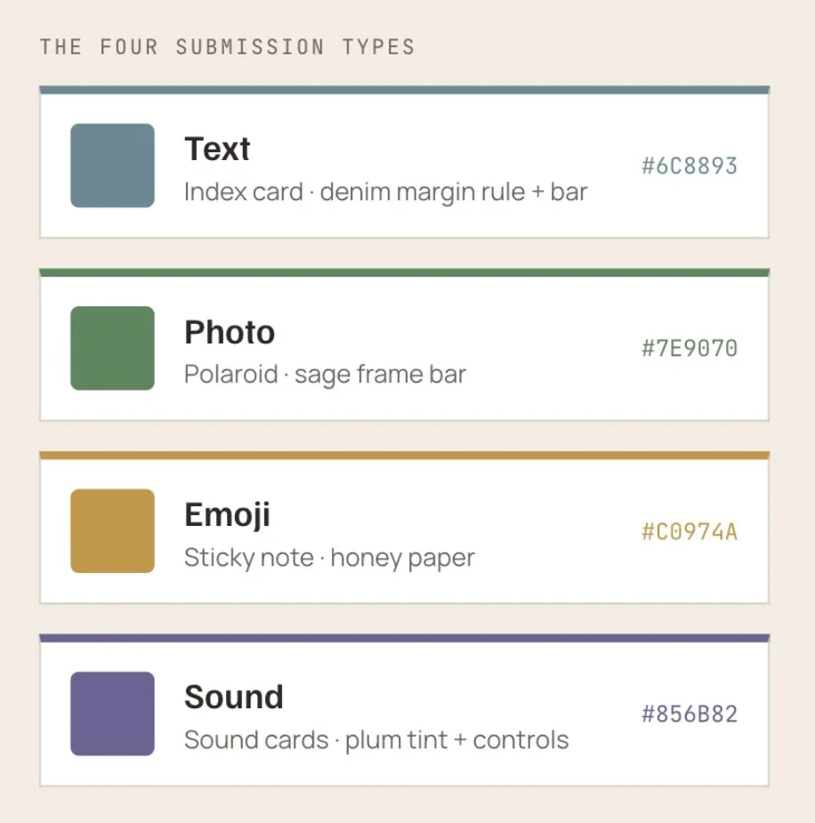
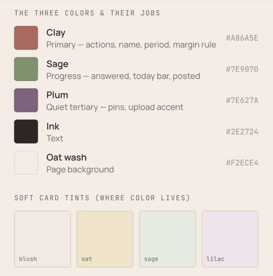

Because everything already pointed at a shared token set and ran through the same handful of layout primitives, most of the work was changing values in one place and watching them propagate. And because every styling change ran through my systems-brain skill, even my messier mid-pass experiments stayed inside the token system instead of spawning new one-off values.
I changed my mind about styling decisions a lot (all my commits were a little chaotic), and when it was time for final code review and simplification on the entire branch, I was nervous. Surely something in the system had drifted with all of my back and forth changes…but the code reviews only turned up a couple of small things, which we fixed in a few minutes, and then deployed the styling to prod.
That’s the payoff of the systems discipline, and it’s the part of working with AI as a designer that I think gets missed. The AI builds fast either way. A clean, tokenized system and quality guardrails are what let it build fast without drifting into a mess you pay for later.
Iterating and improving the product
With the biggest holes patched and styling finished, I moved on to the fun part: gathering feedback and iterating on what I’d built.
The feedback
Feedback came in via texts, voice memos, and in-person conversations, and one note was unanimous: everyone loved the Saturday fridge reveal. Not being able to see anyone’s posts until the end of the week was a fun surprise for all.
I got plenty of feature requests, but also a few “squishier” notes that turned into a small rearchitecture I shipped recently.
From my sister:
I kind of want to be able to click on the top left and have it bring me somewhere…like a home screen.
She was referring to “The Family Fridge” text that sits in the top left of the global header.
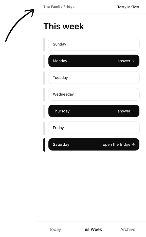
It’s disorienting when I submit a prompt response and then it disappears. I can’t see it again until the week reveals on Saturday. I found myself looking for my recent submission to check if I had made a typo, but I couldn’t find it anywhere.
This wasn’t a bug, just the existing architecture at the time: once a user navigated out of a submission flow, they had no way to view what they posted until Saturday.
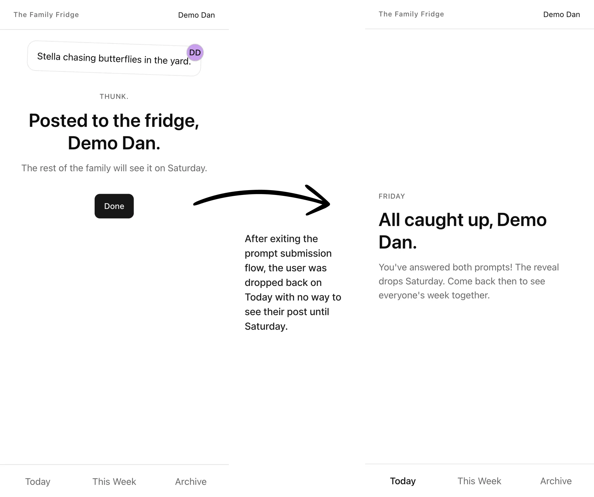
Her suggestion was to add a Profile section where she could see all of her own posts.
From my own dogfooding:
For the first week or two, I would cheat and look at the fridge early to see who had posted and who hadn’t. In the browser, this was simple: I would just manually type in the URL I needed.
But once I installed it on my home screen as a PWA, it launched full-screen like a native app. With no URL bar to edit, I stopped peeking. This made me realize two things:
- First, I really liked the Saturday reveal when all of the posts were a surprise and I hadn’t been snooping.
- Second, I felt more disconnected from the family on weekdays. The app was filled with silence…I didn’t feel like I was keeping up with my family, which was the whole point.
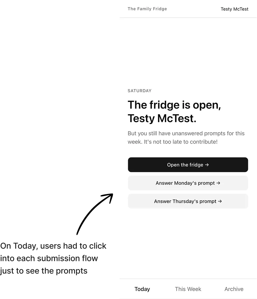
I also found myself mulling over a prompt response for multiple days. I would open the app on Monday and see what the first prompt was, but likely wouldn’t respond to it until later in the week. But the current architecture hid all prompts behind at least one click, since they were only visible within the submission flows. This felt like an unnecessary extra step just to read the prompt.
The rearchitecture
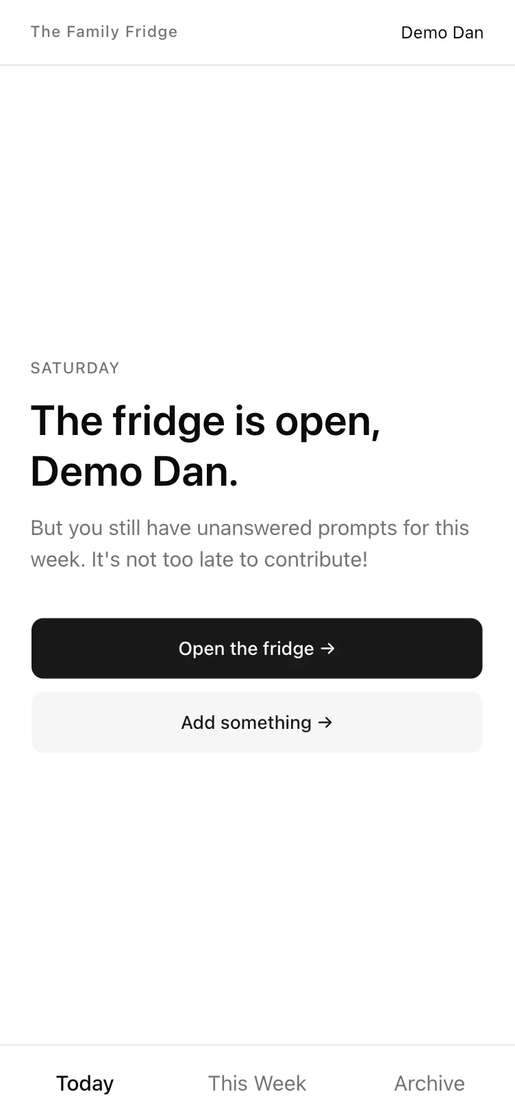
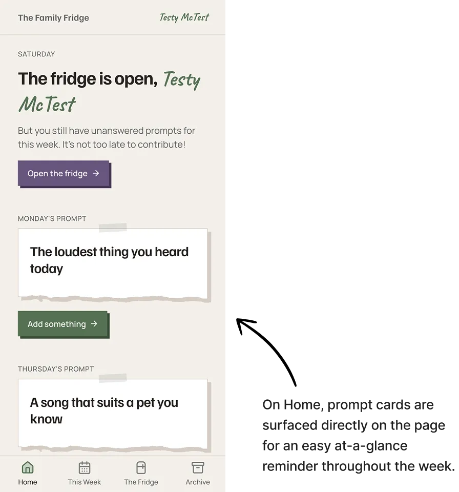
I expanded “Today” into a broader “Home” page. This satisfied my sister’s ask for the top-left link to take her somewhere, and left room for me to add the prompt cards directly on it, now that the page’s scope was broader than just “Today.”
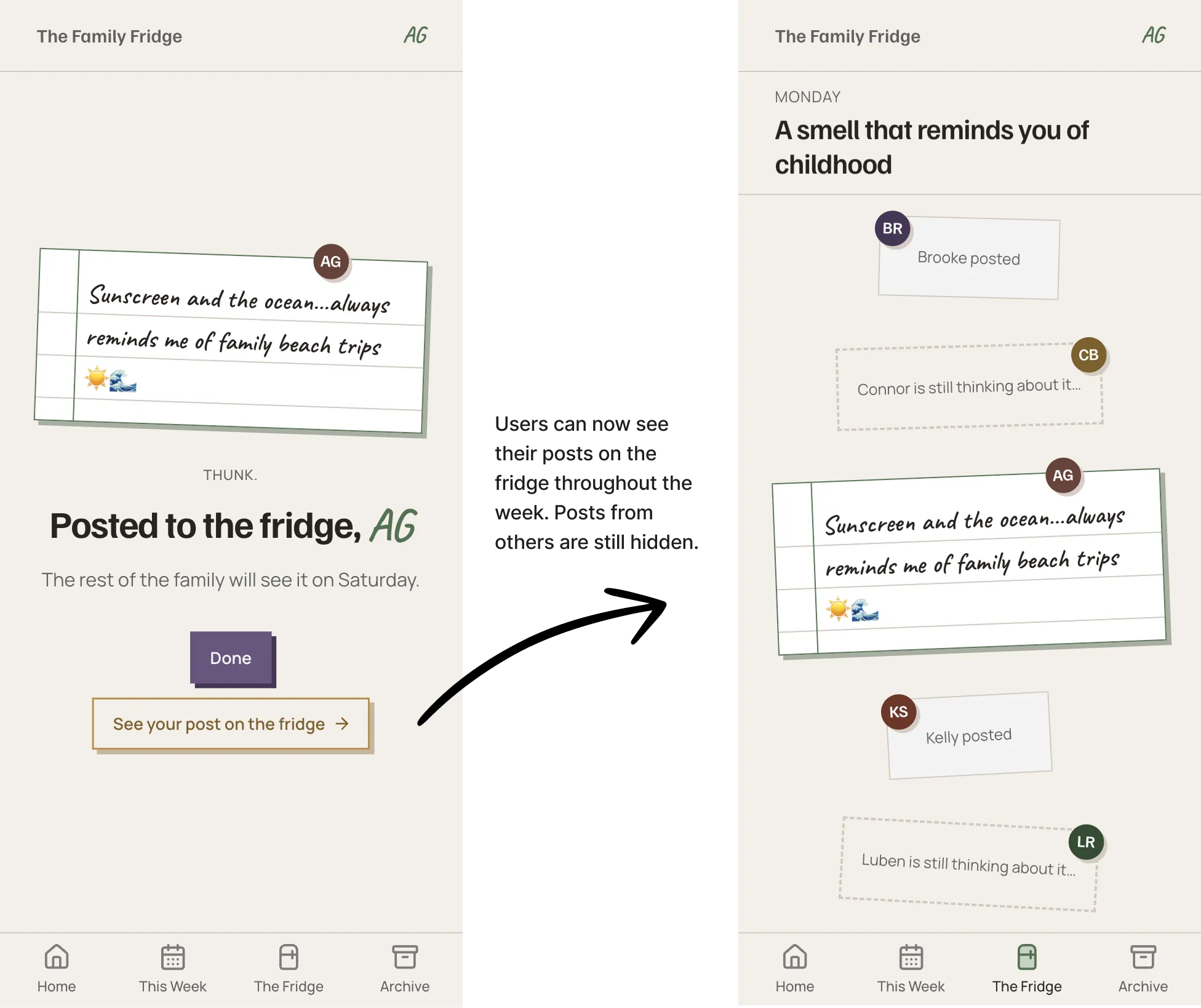
I also added “The Fridge” as a permanent link in the global nav, and made it a stateful page. Users could now see their own posts on the fridge after submitting them (solving my sister’s post disappearance pain point), and they could also see who else in their family had posted. The real submissions from other family members were still revealed on Saturday, keeping the delightful reveal that everybody loved.
Under the hood: my AI workflow
My workflow began with just Claude Code and Paper, but gradually expanded over the course of the project.
The sweep skill
Back in April, just before the MVP build, I had Claude run an audit on all the planning files and documents it had written for the app to make sure everything was tight before we wrote code. That audit surfaced 23 inconsistencies, and that was just among planning documents. I was surprised by how much drift had crept in, and I knew it would be worse and more expensive to fix once it was living in real code.
So I built the sweep skill: a repeatable closeout pass to run at the end of each build session. It walks the project against a fixed checklist with items like: Do any docs contradict each other? Are there stale references pointing at things that moved? Did any decision get made in conversation but never written into a file?
I ran it after every phase of the build, and it caught something every time. It presented findings as a list for me to review, then fixed them once I gave the go-ahead. I don’t have an A/B of what the build would have looked like without it, but I’m confident it saved me a pile of bug fixes and refactor work down the line.
I found a hole in the skill after that photo-upload bug surfaced, patched it, and the skill is still in use today across my other work. I leaned on it building this very portfolio site, and for AI projects at my current job.
The systems-brain skill
If sweep keeps the project consistent between sessions, systems-brain keeps it consistent within a single change. It’s a skill I built for the token discipline I needed to enforce at every stage of the build.
I think in pixels and vibes (“darker,” “more breathing room,” “bump that to 24px”), but a design system (and the AI working in it) thinks in tokens, scales, and patterns. This skill’s job is to be the bridge: it takes my plain-language request and maps it to the design tokens already in the codebase, instead of hardcoding a one-off value or inventing a new variable. If I ask for something that lands between two steps on the scale, it snaps to the nearest token and tells me the gap (“used spacing.5, 20px, one step below your 24px”). And if I try to hardcode a value anyway, it pushes back once and makes the cost real before it’ll do it, because one-offs are exactly how a token system erodes until half the codebase ignores it.
I would often prompt Claude to “use your systems brain,” and it would invoke the skill and seamlessly map my request into the token system. This skill is essentially systems thinking in a bottle, and it’s a big reason why the styling pass survived its final code review with only a couple of small fixes.
Roadmap
Cheap additions, easily reversible:
- Optional captions on sound submissions, both song links and audio uploads.
- Tap to zoom on images.
- Animations and other visual polish.
Larger pieces of work to enhance the product experience:
- Improve emoji selection. Allow users to select specific emojis with their phone’s native picker instead of shuffling through a limited list.
- In-app audio trimming. Allow users to trim audio clips that they record in the app.
- Profile area. Allow users to view an archive of only their own posts, as well as the option to customize their magnet shape and color.
Deprioritized requests
- Retroactive fridge submissions
- Editing fridge submissions
- Likes and comments on fridge submissions
These three requests are deferred not because they’re hard to build, but because I’m not sure they belong. My family was split on all of them: two wanted likes and comments, one explicitly didn’t; one wanted to edit posts after submitting them, another said they didn’t want that option.
These features are table stakes on every mainstream social app, but the soul of The Family Fridge is purposefully antithetical to “normal” social media: no streaks, no metrics, no punishing the slow responder. A feature being common isn’t a reason to add it; it’s a reason to look harder.
I ran the “like” request through the same JTBD lens I used on the audio problem. What job is a family member hiring a “like” to do? Probably something along the lines of:
When I want to acknowledge something someone shared without the social weight of a full conversation, help me signal genuine appreciation quickly and proportionately.
This is a good job, and the exact connection the Fridge exists to create. The trouble is that the standard implementation drags along everything I built the product to avoid: visible counts, the sting of an unliked post, the slow creep toward performing for reactions.
The real question isn’t whether to add “likes” as a feature, but whether I can serve “I want you to know I appreciated this” without importing the mechanics that would erode the soul of the product.
The other feature requests have similar conflicts. Editing raises the same tension between fixing a typo and inviting people to perform; retroactive posting pits my soft spot for slow responders against the weekly reveal everyone named as their favorite part, as well as the integrity of the archive.
None of these are a “no.” They’re a “not until it earns its place,” and the bar is the same for all three: does it deepen the connection the Fridge is meant for without smuggling in the patterns it was built to reject? Until I can answer yes, I’m shipping the small stuff and keeping the soul of the product intact rather than adding features because every other app has one.
Reflections
This started as a way to stretch my design muscles and get some real product reps in. It became something I’m very proud of, and it sharpened the instincts I want to carry into whatever I build next.
When an AI can build at the speed of light, a designer’s value moves up the stack. The job stops being producing the work and becomes the judgment that steers it: what to build, what to refuse, and what guardrails to enforce so the whole thing doesn’t drift. I found that I love operating at this higher level, where my role is more akin to a film director than a camera operator.
It doesn’t hurt that I had a ton of fun doing it. Building something for the people I love was the most fulfilling work I’ve done in years, and I think we’ll be using The Family Fridge for a long while.