A 13-month, end-to-end redesign for a Coca-Cola research council. I owned UX from start to finish, ending in a site users called “tremendous” and the client called “world-class.”
The result
My team delivered a complete digital transformation for CCRRC: a new brand identity and a fully redesigned website. I led UX design from discovery through launch with three moves: organizing the research library, redesigning how reports got read, and rebuilding the design system underneath so the build would match the design intent.
Simply put, IfThen knocked it out of the park. We are absolutely ecstatic with our new brand and website. The quality of their design work — from the visuals to the overall site functionality — is world-class. They didn’t just redesign our digital presence; they revitalized CCRRC.
— Marvin Vines, VP of Industry Leadership, The Coca-Cola Company
Post-launch user testing on the new site showed 6 of 6 users completed the core task with glowing reviews from participants.
The challenge
The Coca-Cola Retailing Research Council is a 46-year-old research organization that analyzes retail trends for supermarkets and convenience stores globally. They had an outdated digital presence: an old brand identity that was undermining their reputation, and a website with zero analytics, so they had no visibility into which research actually resonated with users.
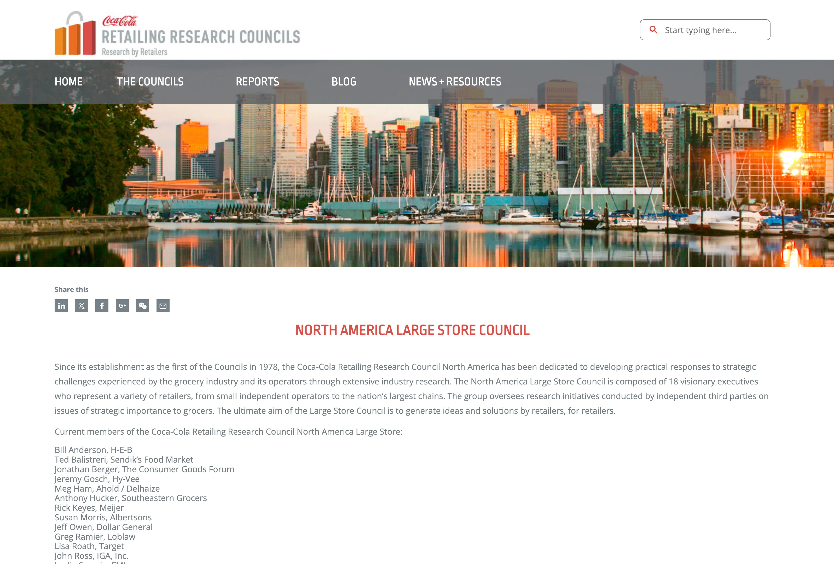
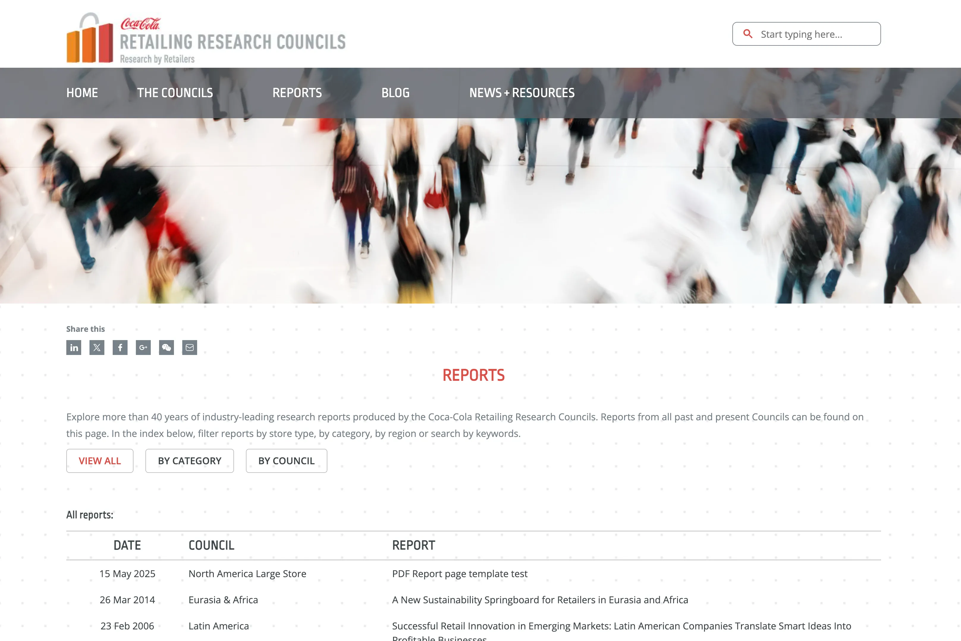
It’s outdated, it just needs a total refresh all the way around… we have nowhere to go but up.
— Marvin Vines
I conducted 4 stakeholder interviews and pulled 3 core needs out of them:
- Measure audience engagement. Zero analytics meant no insight into which research resonated.
- Make research accessible. 100-page PDFs weren’t built for discovery or easy reading.
- Restore brand credibility. The perception of CCRRC was outdated; it had to shift.
Our brand team tackled #3 with a new visual identity. My UX work focused on solving #1 and #2.
Move 1: organizing the research library
CCRRC’s research library contained 72 reports spanning diverse topics, from employee retention to supply chain technology to sustainability. This diversity wasn’t accidental: their research process pulled sitting C-suite executives from major retail companies to discuss real challenges, then commissioned research on the topics that came up. With council membership rotating each cycle, topics shifted, and the corpus grew in directions nobody planned.
The challenge was making this valuable research truly accessible without locking the structure into a shape that would break with every new report.
Early explorations
My first instinct was to split content by audience: Large Stores and Convenience Stores, the two retail channels CCRRC’s councils serve.
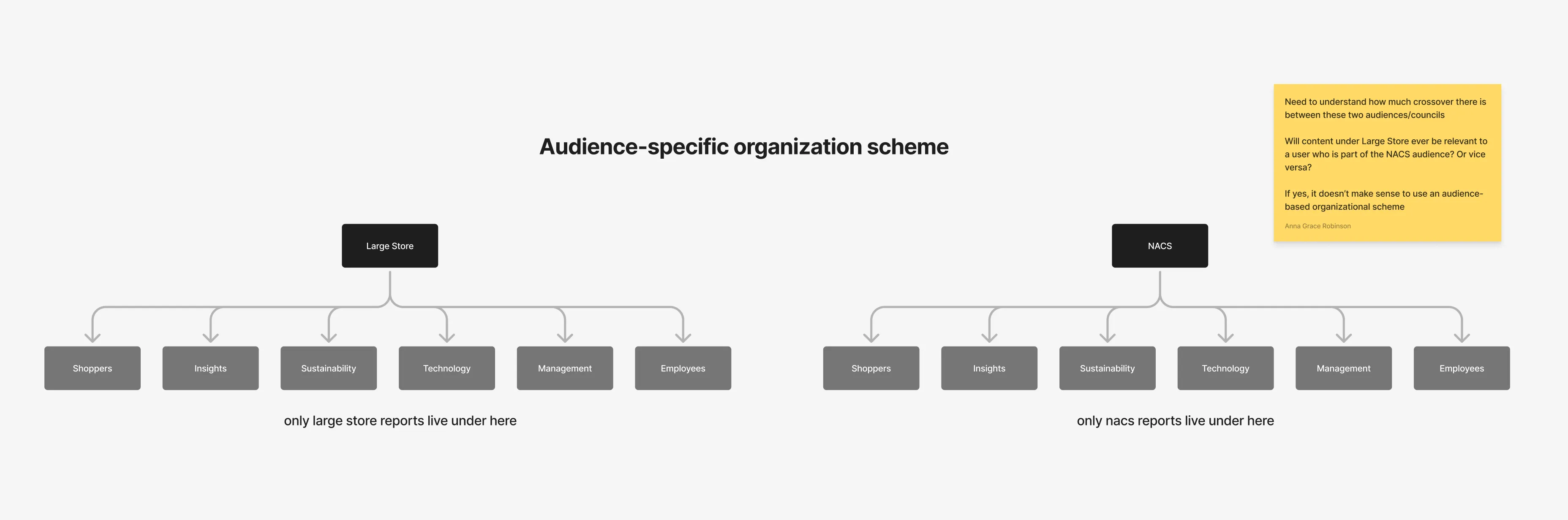
But several research topics overlapped both channels. Employee retention, for example, applied to both. Forcing users to choose one path would either hide relevant content or require duplicate listings.
Then I tried building a topical hierarchy deep enough to handle any report.
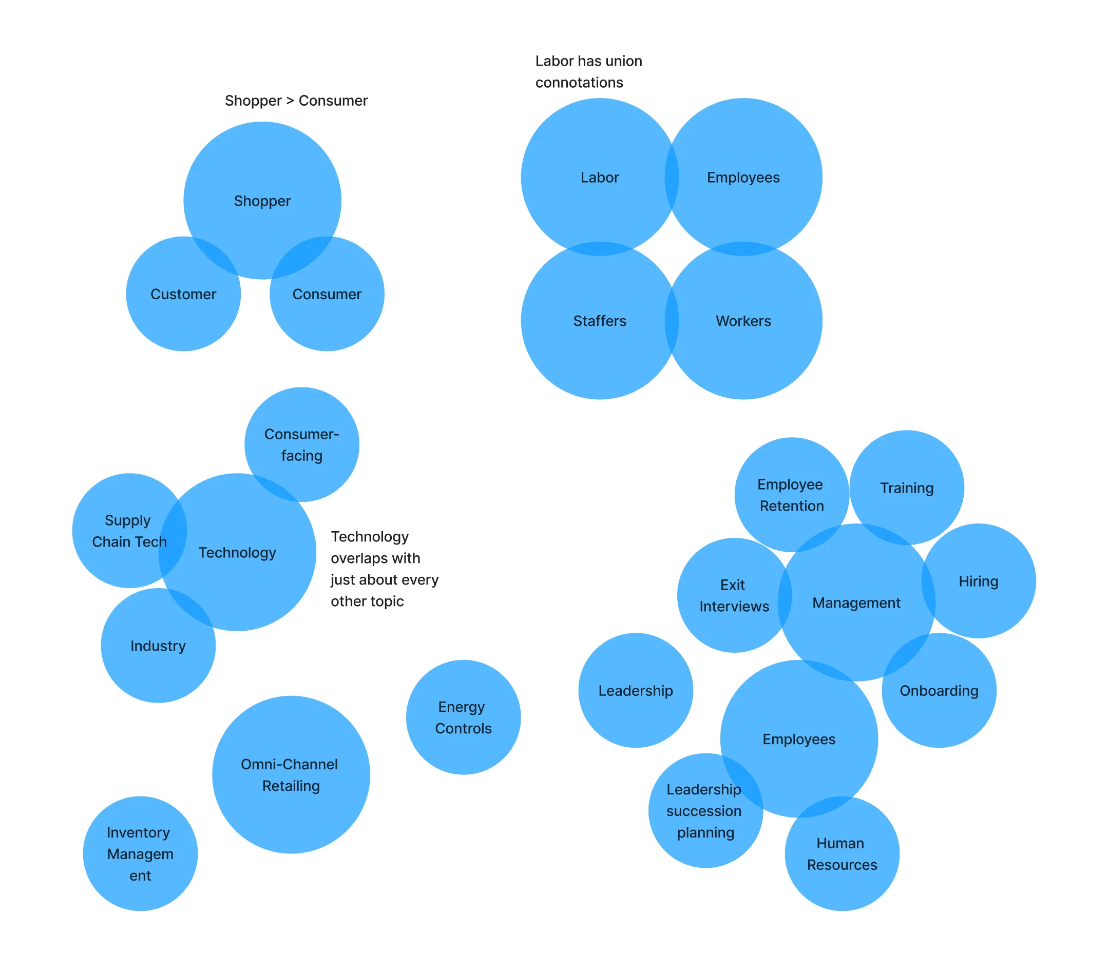
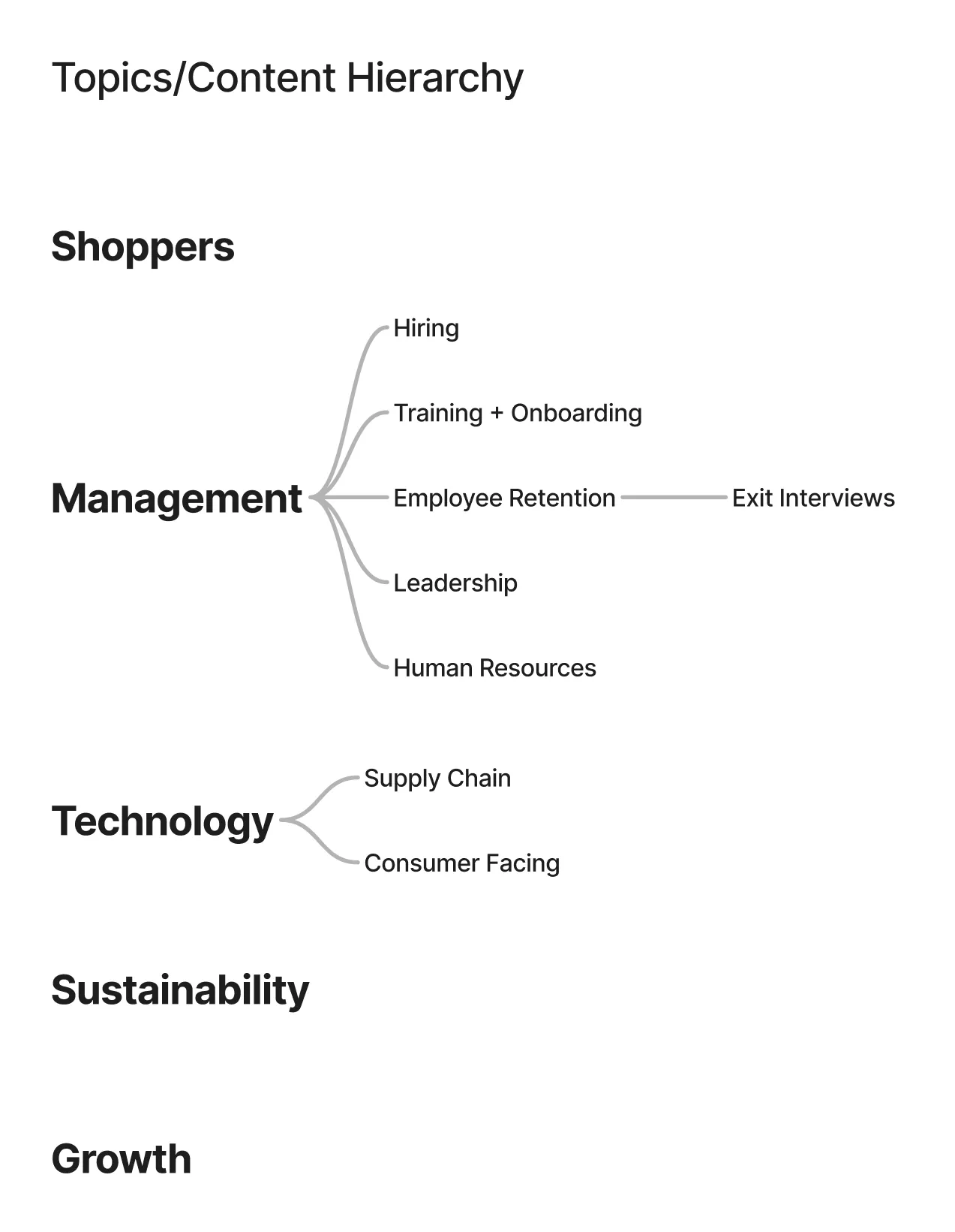
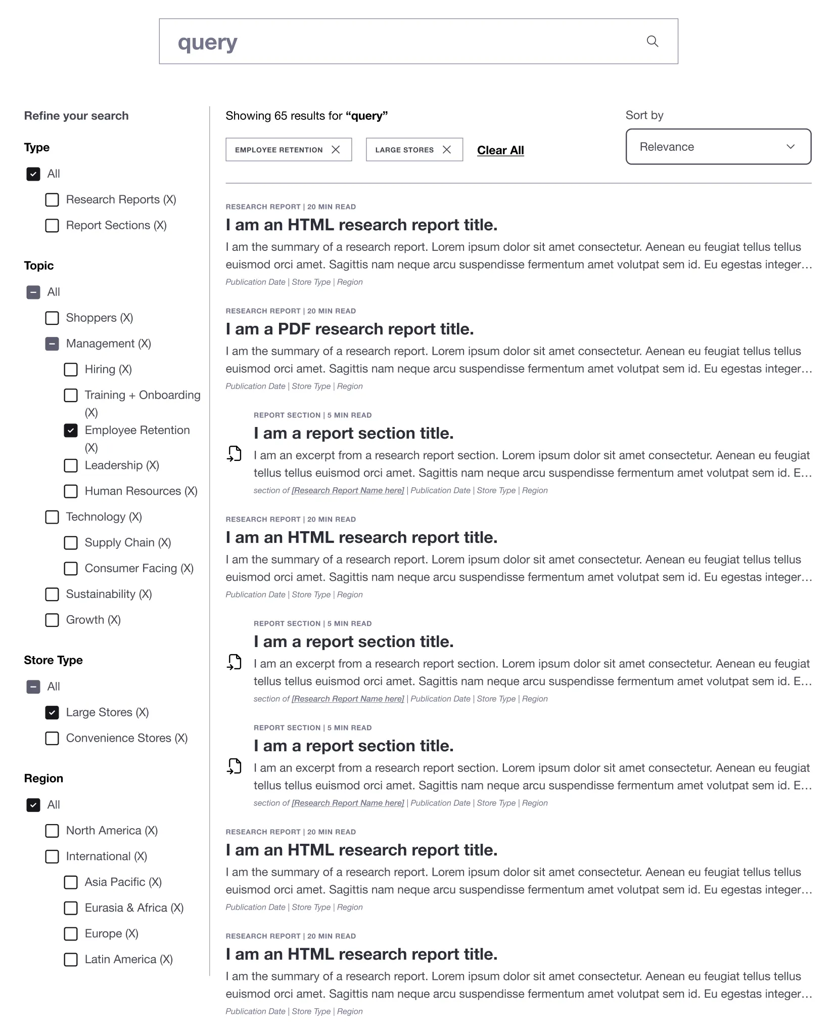
Two problems surfaced when I wireframed it. First, scalability: I was custom-building a filing system for today’s report library that wouldn’t flex for tomorrow’s research. What happens when a new report doesn’t fit the existing boxes? Second, the user experience was barely better than CCRRC’s current chronological list with basic filters. We’d polished the same model, not delivered the leap forward the client needed.
The landed solution
Dual pathways and question-based content.
I went hybrid. Rather than forcing one organizational scheme, I created what I called “diving boards into the pool” — multiple entry points into the research library:
- 4 topic-based pages: People & Culture, Shopper Insights, Sustainability, Technology
- 2 audience-based pages: Large Stores, Convenience Stores
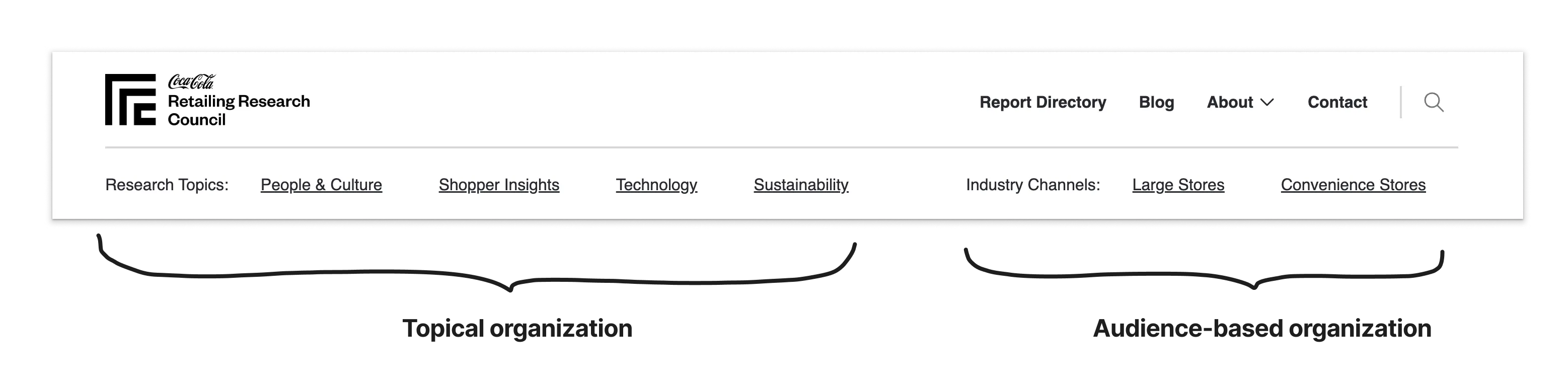
We finalized those 6 labels through 4 rounds of remote, unmoderated card sorting. The structure supports users starting from either a topic-focused or channel-focused mental model and still reaching what they need.
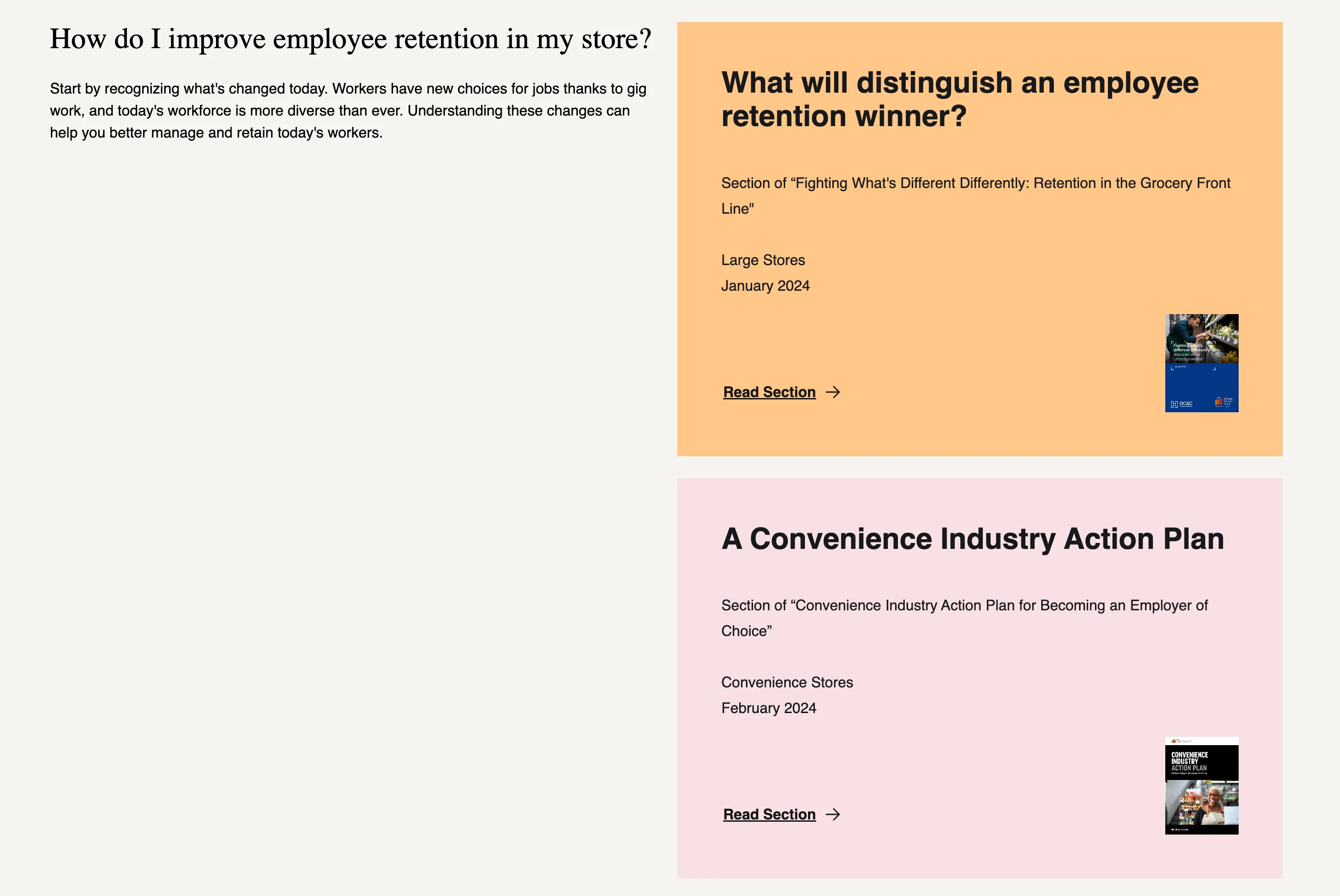
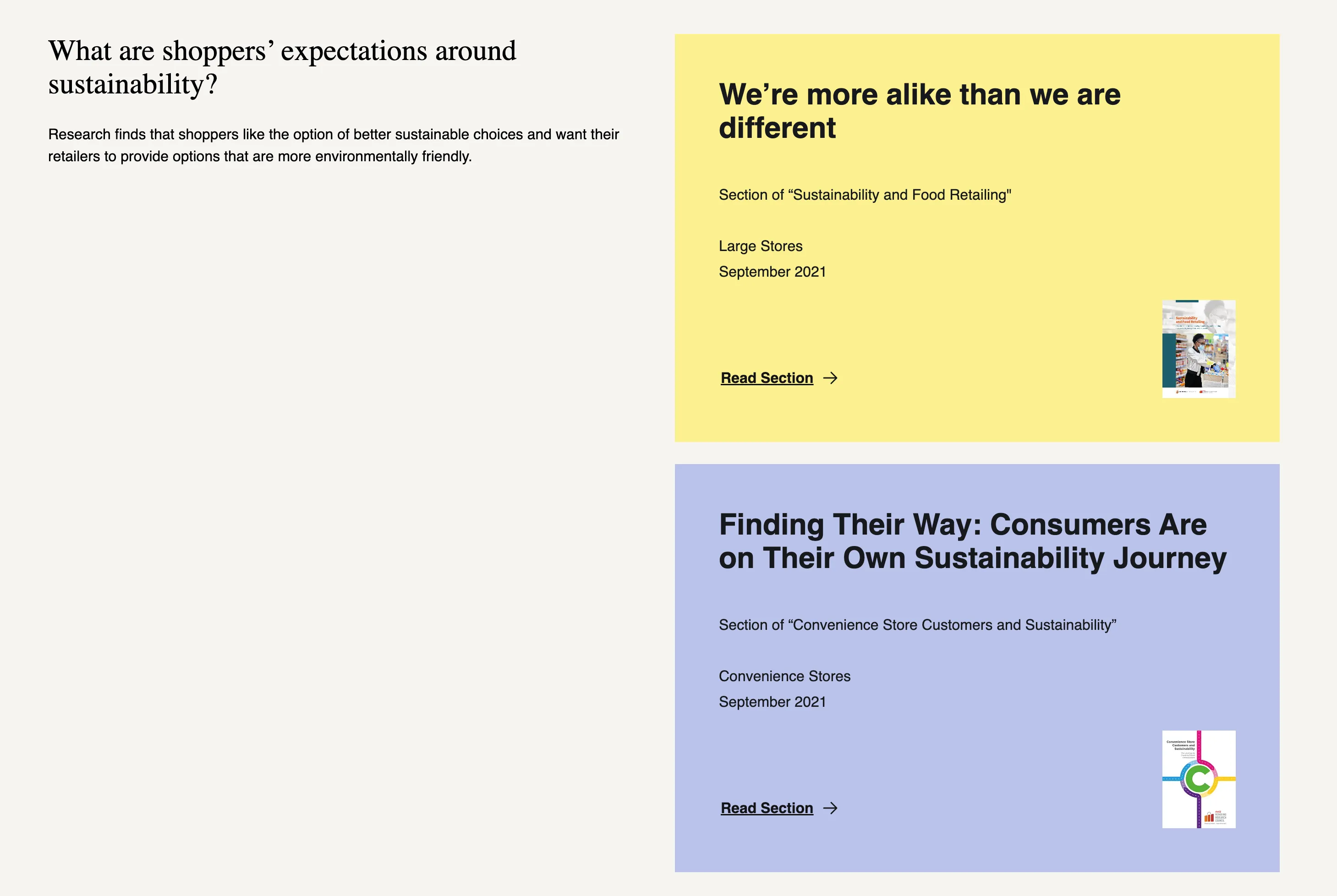
On each topic and audience page, I shifted from displaying report titles to presenting research as answers to questions:
- Question: How do I improve employee retention in my store?
- Answer: [Report link] • [Specific section link]
This format made research feel immediately actionable, and built in a scaling path. As new reports get published, we add or update questions. No taxonomy restructuring, no complex tagging.
Validation
Post-launch testing with 6 participants validated our solution. When asked to find research on employee retention, participants split their strategies:
- 4 used topic navigation first
- 2 used audience navigation first
- All 6 successfully completed the task
Supporting multiple mental models was the right call. Neither pathway was obviously superior, but both worked.
There’s a lot of information here, but it’s presented in a way that doesn’t feel overwhelming.
It feels like something that I can easily navigate and find what I’m looking for.
5 of 6 participants rated findability as easy or very easy, giving top scores despite the size and diversity of the research library.
Move 2: modernizing how reports get read
CCRRC’s research lived exclusively in PDFs, some nearly 100 pages long. This created two problems:
- For users: they had to page through long PDFs to find relevant sections, with no way to navigate the long-form content efficiently.
- For the client: their new analytics would only capture report downloads, and they’d have no visibility into which sections drove engagement.
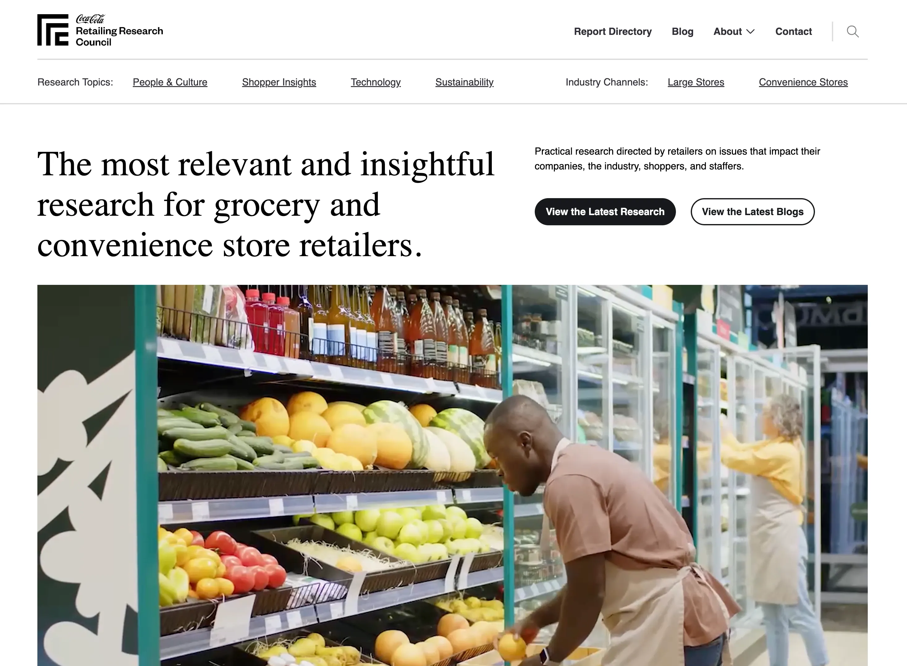
Rather than migrating PDFs as-is, I proposed converting reports to HTML with interactive navigation. That would give users visual and interactive wayfinding through long-form content, enable section-level analytics, and let users share links to specific sections.
Converting to HTML also closed an accessibility gap. A 90+ page PDF is flat, often untagged, and brutal to navigate with a screen reader. Rebuilding reports as semantic HTML with a proper heading hierarchy and a keyboard-navigable outline meant the research was usable with assistive technology, not just nicer to look at.
Original PDFs stayed available alongside the HTML. The hybrid approach meant users could choose their preferred format while giving the client granular engagement data.
What testing showed
The dynamic navigation was a hit: every single testing participant mentioned something positive about it.
I like that you have the little outline of information here. That way you can skip easily to sections that you’re looking for.
I like having the outline here… overall, the format of it is tremendous.
Multiple participants mentioned appreciating the PDF option for saving local copies, which confirmed the decision to offer both formats rather than HTML alone.
I like the online articles that I can access right here, and I also like being able to download it as a PDF.
The client now tracks section-level engagement (link clicks within the dynamic navigation) and sharing behavior (section link copies on headings) as well as report downloads. They have their first view into which content actually drives value.
Move 3: rebuilding the design system underneath
By the time the brand team handed me their UI files, I’d been living in the IA and the report architecture for months. The designs were visually pristine but architecturally messy: inconsistent components, spacing that drifted between mocks, typography that didn’t trace back to a system, layers organized in whatever order someone happened to build them.
If we built it based on those mocks alone, we’d ship a beautiful site that fell apart in a year. So I rebuilt the design system underneath before dev started, then embedded myself in the dev workflow to make sure what got built matched what got designed.
Refactoring the system
I rebuilt all page designs against consistent, reusable components, established clear naming conventions and layer organization, wrote component documentation for developers, and documented interaction states for the more complex pieces.
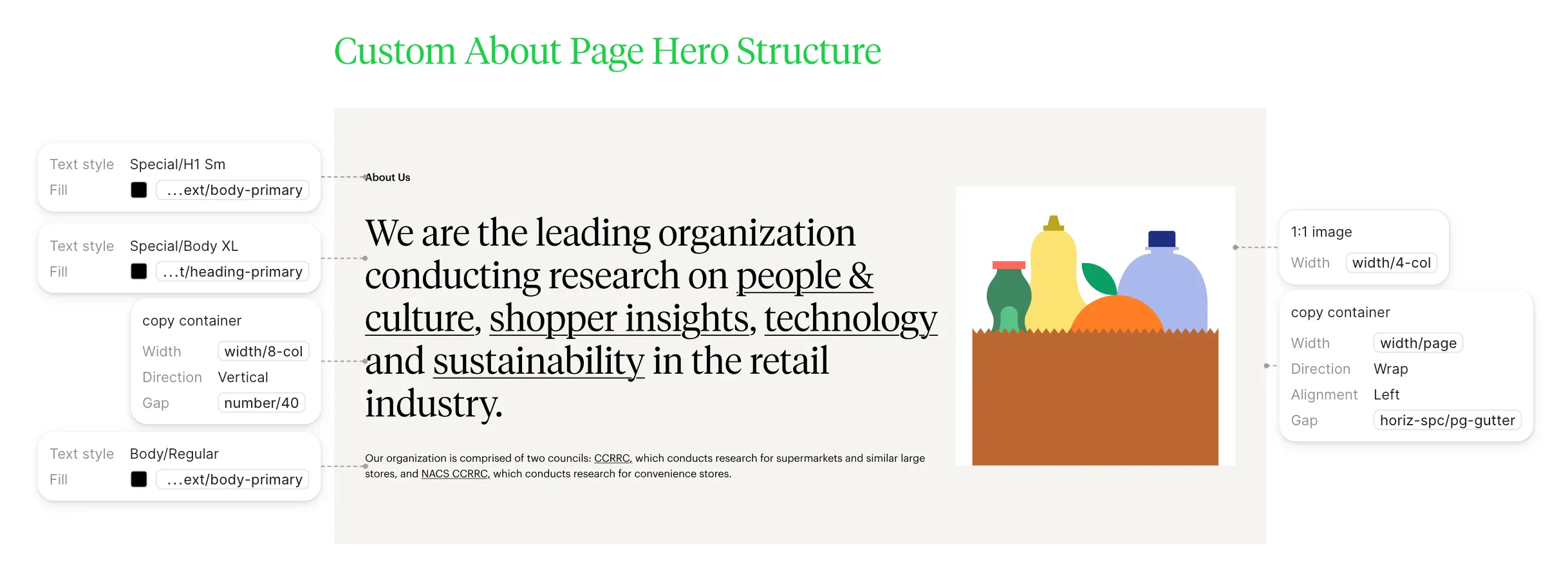
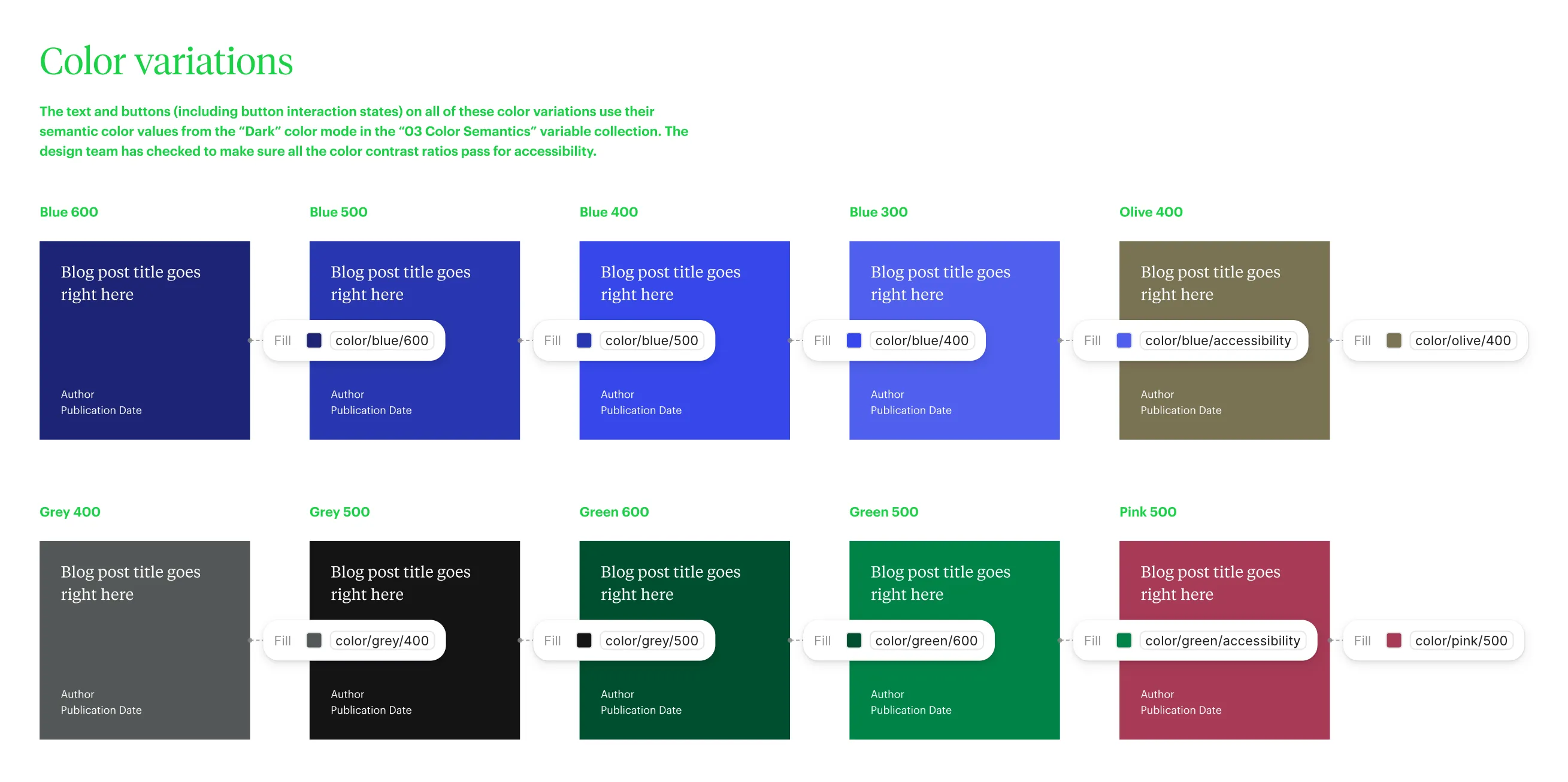
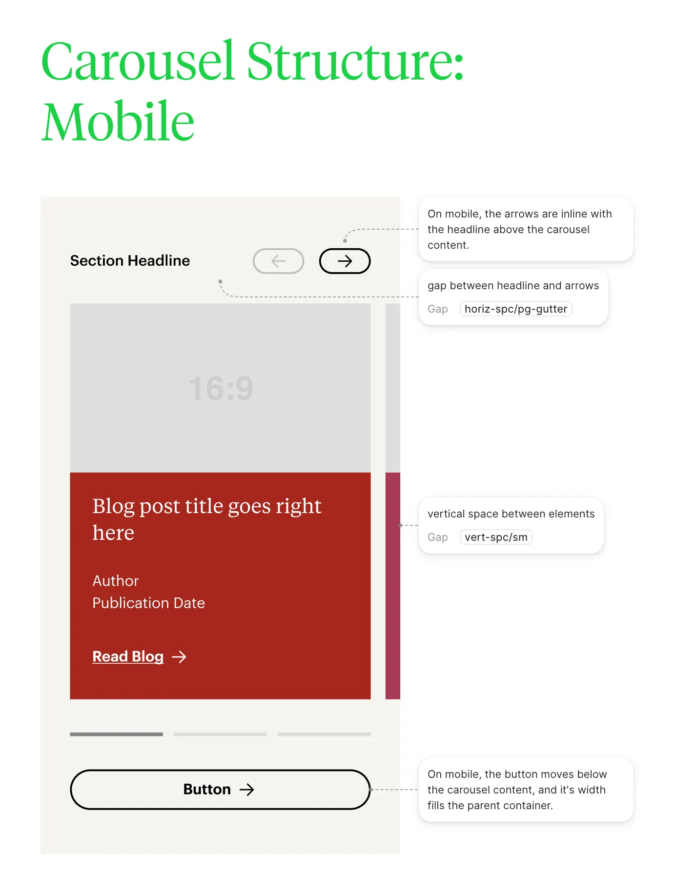
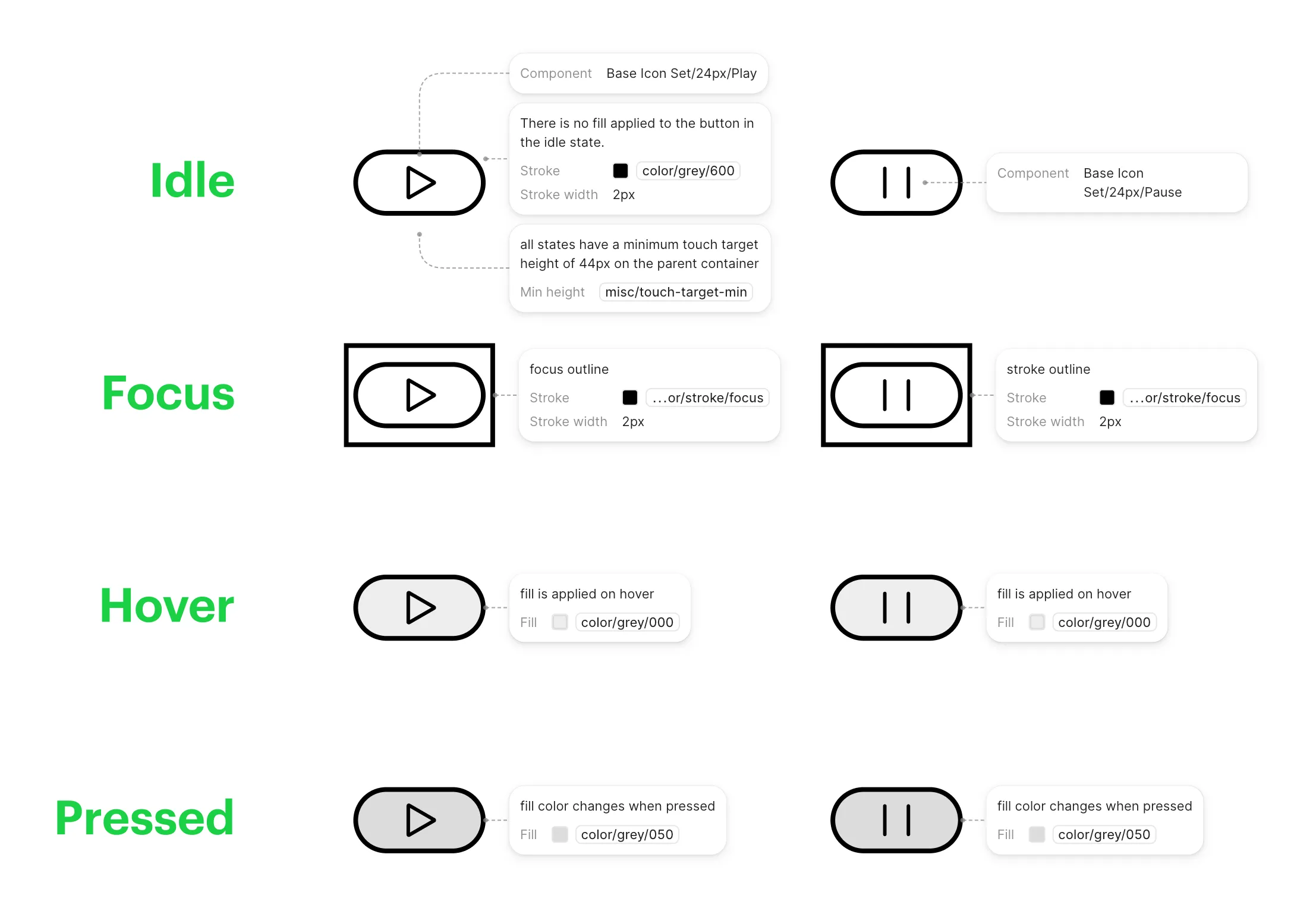
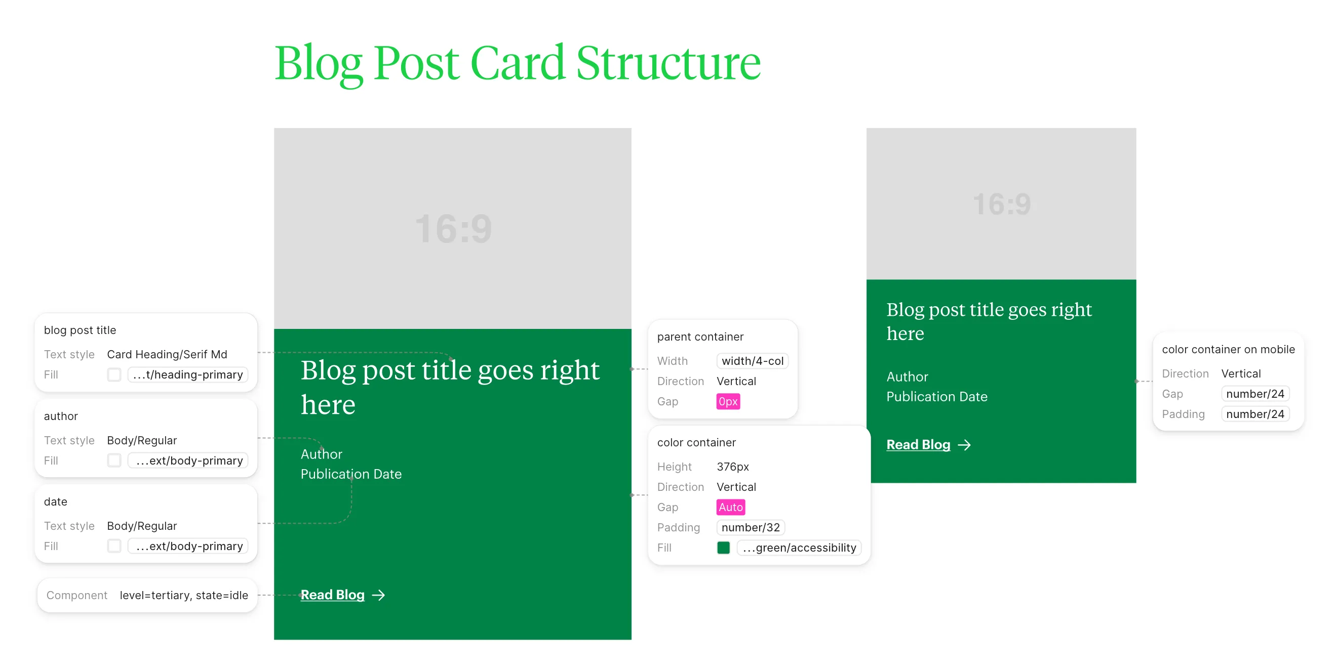
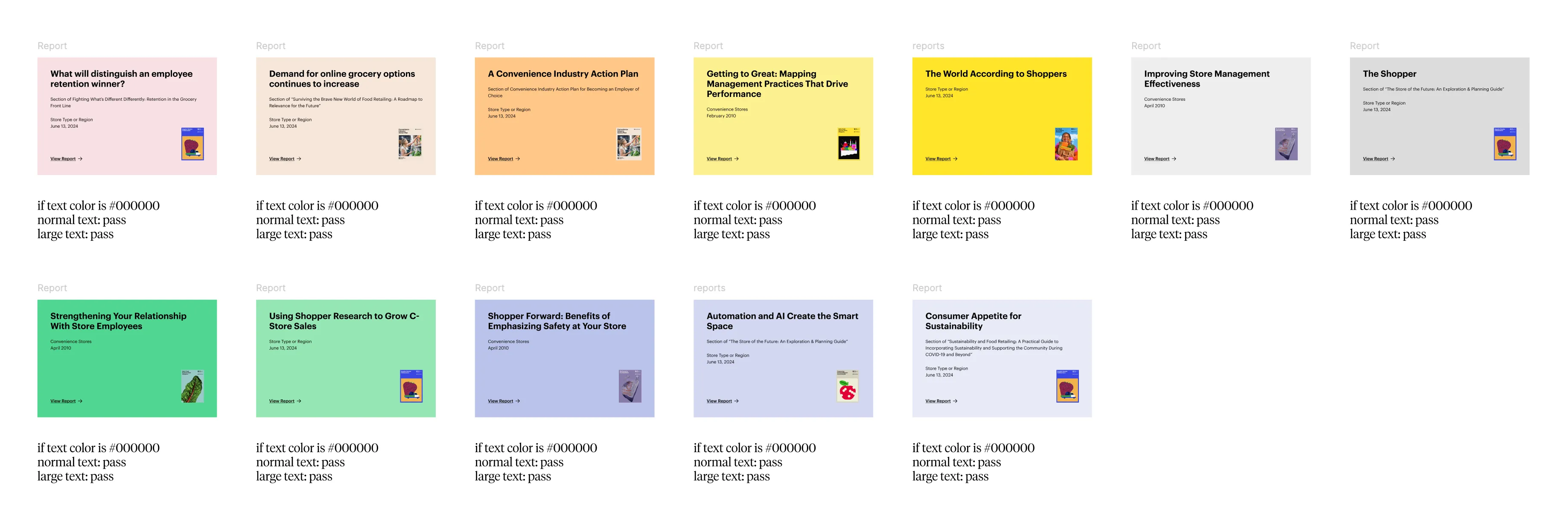
The brand team owned the visual identity; my job was making it real and accessible. Their designs used lots of colored card backgrounds with text sitting on top, and many pairings didn’t clear WCAG AA contrast as drawn. So I worked back through the palette, added color variables needed to hit AA on every text-and-background combination, and adjusted the designs where they failed. Accessibility wasn’t a pass at the end; it was built into the system before dev started.

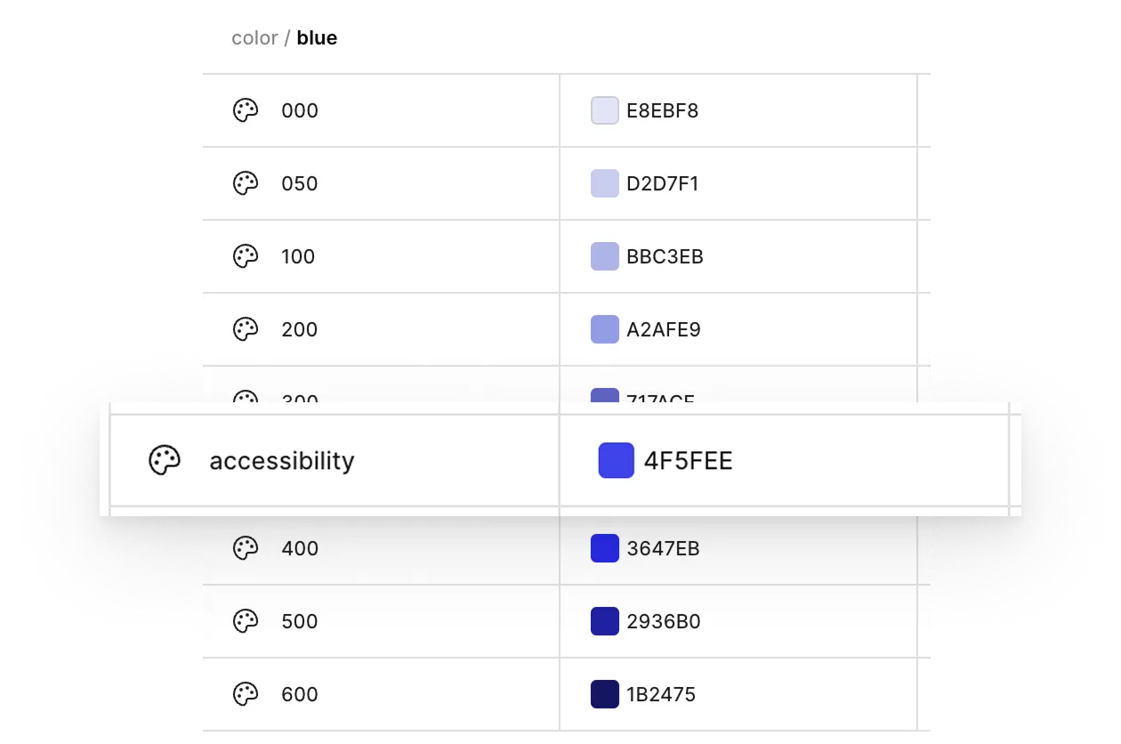
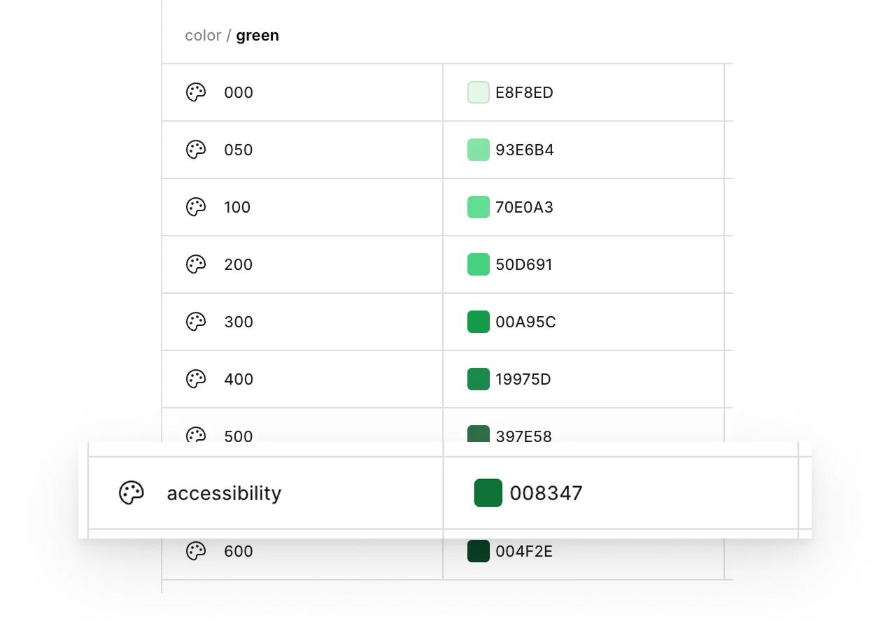
Anna Grace’s design system for CCRRC was one of the most carefully considered I’ve worked with as a frontend developer. Nothing was left to chance. Every component and layout followed a consistent set of rules, which made implementation straightforward and kept the build predictable from ticket to ticket. The structure translated directly into code, so the path from Figma to implementation rarely required guesswork.
— Thomas Barnwell, Senior Software Engineer
Embedding in dev
Then I stayed in the build process to keep quality from leaking out at each handoff:
- Wrote detailed Jira tickets for each component
- Joined grooming calls with developers
- Added a “Design Review” column to our Jira workflow
- Reviewed builds-in-progress to catch issues early
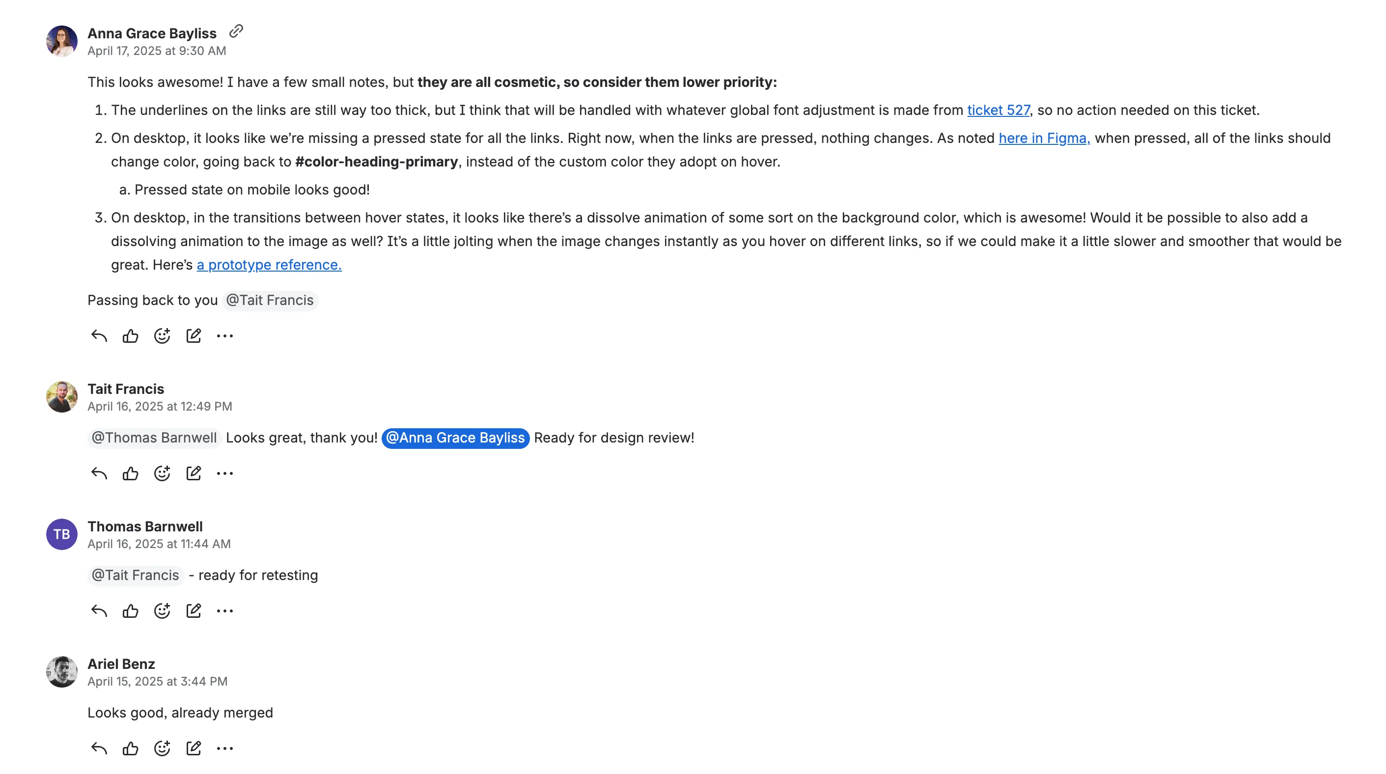
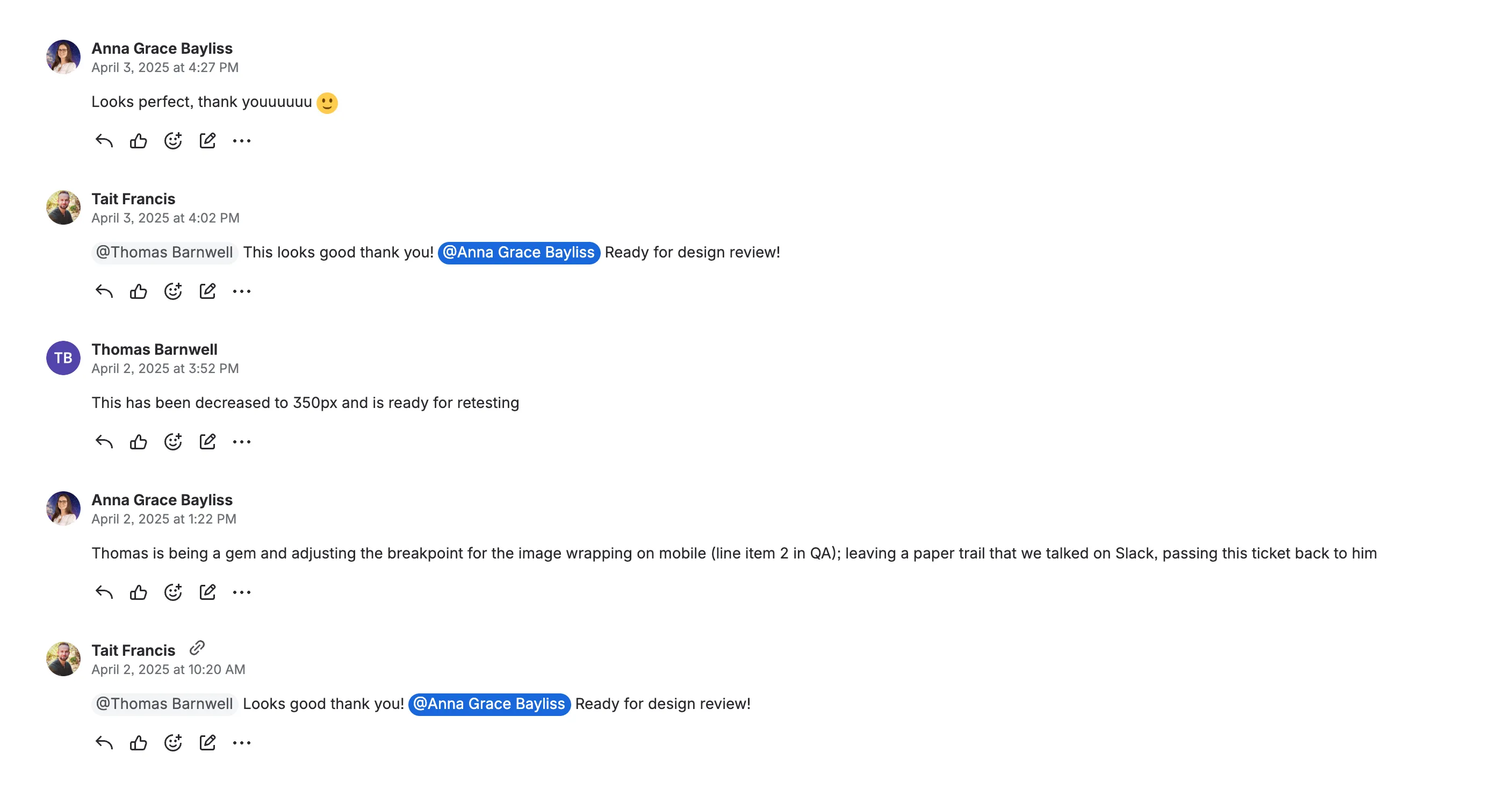
The Design Review column in Jira was an interpersonal win as well as a workflow one. Adding it meant getting the developers and our PM to agree to a new step in their process and adopt it in practice, which is easier said than done, but they adapted quickly and gracefully.
This broke our agency’s typical pattern, where designers see builds late, visual issues get deferred to post-launch “hardening” tickets, and site quality suffers. Staying involved and owning the system through development made the difference between a good and excellent final output.
The result: a polished final site that matched what we designed.
Project impact
User testing results
Remote, unmoderated testing with 6 participants post-launch showed:
- 6 of 6 completed the task when asked to find research without using search
- 5 of 6 rated findability as easy or very easy, giving top scores
- 5 of 6 rated CCRRC as highly credible (brand perception successfully restored)
This aligns with my expectations of what a company like Coca-Cola would put out. I would say it’s similar to what I would expect from a consulting firm or something like that. The research is very good.
What I think works well is how approachable and inclusive it is. It makes me feel welcomed, like it’s relatable to me.
One memorable moment
Sometimes participants forget they’re still being recorded after the task-based portion of the test is finished…we had a 1–5 rating question at the end that asked: “How likely are you to return to this site or recommend it to others in your industry?”
One participant read the question out loud, then muttered “Very damn likely”, and smashed the 5 rating button. (I may or may not have fist pumped in my home office when I watched it.)
Analytics foundation
CCRRC had no analytics baseline going in. Our team set up Google Analytics tracking and built a custom Looker Studio dashboard, which means this project established their first measurable performance data.
CCRRC brought us back for more work in 2026, with two new report releases planned. Heading into this new phase of work, these are the metrics we’re tracking to measure success:
- Referral sources to reports: how are users finding the research?
- Engaged session time on reports: are people reading, or just landing?
- Clicks and engagement on specific sections: which parts of the report are resonating the most?
- Report downloads as a share of report page views: how often does interest convert to a saved copy?
- Section link copies: are users copying links to sections, either to bookmark for themselves or share with others?
Reflection on tablet
The redheaded step sibling of web design.
One craft thing I screwed up on this project: tablet. At my agency, we routinely skip the tablet breakpoint during design because most client analytics show <5% of traffic on tablet devices, and we followed that pattern on CCRRC.
Then I opened the live site on my vertical monitor and felt instant regret. My oversight was visible immediately: nothing was broken, but the layout shrugged in a few places where it should have held. I felt silly for not realizing it before, but tablet breakpoints also trigger for split-screen views and vertical desktops, both of which log as desktop sessions.
The lesson: tablet breakpoints get triggered more often than tablet devices show up in analytics. Design for all three. (Even though nobody ever wants to design for tablet, the poor thing.)
How I’d build this today
The IA work would happen closer to code
Instead of agonizing over architecture diagrams and wireframes in Figma, I’d use Claude to stand up low-fidelity, live HTML pages I could put in front of users in days and get immediate feedback.
Component handoff would be coded, not prototyped
Figma’s Dev Mode and prototyping tools were my best friends on this project, but today I’d build the interactive and responsive components directly in code, tuning the behavior in a language the devs wouldn’t have to translate. That alone might have caught the tablet problem. Replicating true responsive behavior in Figma is slow (part of why it didn’t happen at handoff), whereas getting a live version into a browser with AI takes minutes and shows you immediately how something feels and resizes when breakpoints change.
I might even be…in the codebase
On other projects at my current job I’ve started building directly in the repo with AI instead of handing off Figma mocks. The tooling has turned out to be the easy part. The harder shift is organizational and social: getting a team to work across the old role lines and collaborate in a new way.
I’ve received a mix of support and raised eyebrows with my venture into the devs’ world, but overall IfThen’s leadership is in support of the direction we’re moving in. I’m treating it as another Figma Office Hours: the tools are different, but we’re still working towards a shared source of truth where designers and developers can wield their expertise in a common language to create quality products.